DIRECTV
Service Eligibility
A collection of error messages, redirect modals, and form fields added to DIRECTV's online sales checkout flow to address service and delivery address validation errors.
DIRECTV
A collection of error messages, redirect modals, and form fields added to DIRECTV's online sales checkout flow to address service and delivery address validation errors.
Part of the customer order experience on the DIRECTV website is entering either a service address, delivery address, or both during the checkout process. When customers enter their address, it is run through several validation databases. When an address is determined to be invalid, the customer needs to be notified that the address is invalid and they are:
How do we keep customers from abandoning their order when their address can't be validated?
Customers will be presented with in-page errors or modals with instructions for how to proceed when their address cannot be validated. Error messages will either include a phone number to call for assistance or a way to redirect around their error.
UX Writer - I drafted the copy for the error messages, form fields, and redirect modal. In this role, I partnered directly with a UX Designer and Producer, and worked with a Product Owner, developers, and other internal stakeholders to clarify the needs for this request.
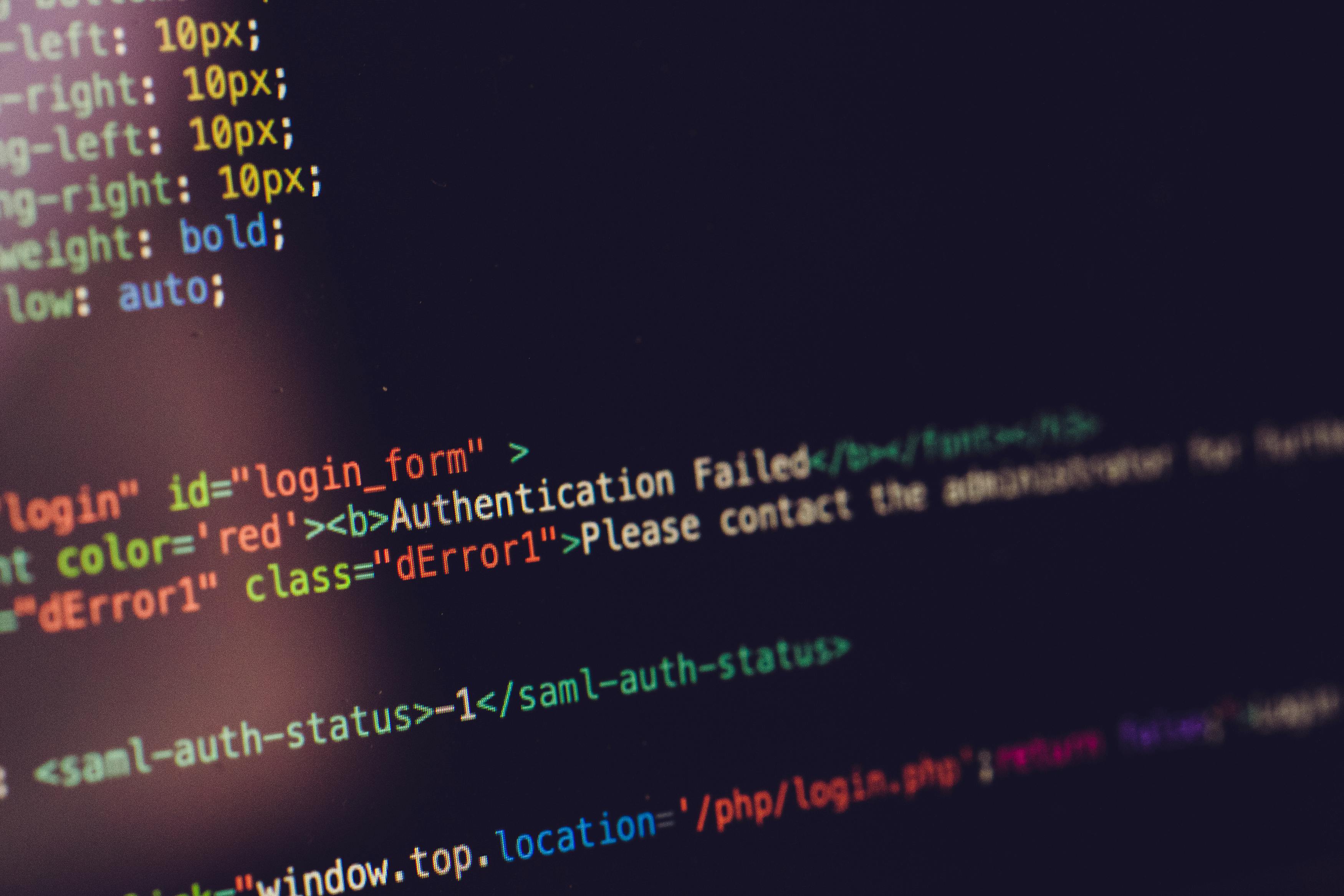
Most DIRECTV UX writing is contained in Content Requirements Documents (CRDs). CRDs let writers add extensive notes including alt text, conditional formatting or display changes, and link targets. CRDs also let developers copy and paste content directly into code.
UX Designers create frames in Figma. Although I worked primarily in Microsoft Word, I also tested content in Figma wireframes for fit. Most content work in Figma is done prior to our first product demo to let stakeholders see what content we are proposing while they are reviewing the design.
The UX team received very little guidance for this assignment. We were provided a list of error codes with either a "Red," "Green," or "Conditional Green" notation:
Because of the lack of clear guidance on what was required, the UX designer and I laid out a rough rubric over a long meeting to break the assignment into different scenarios:
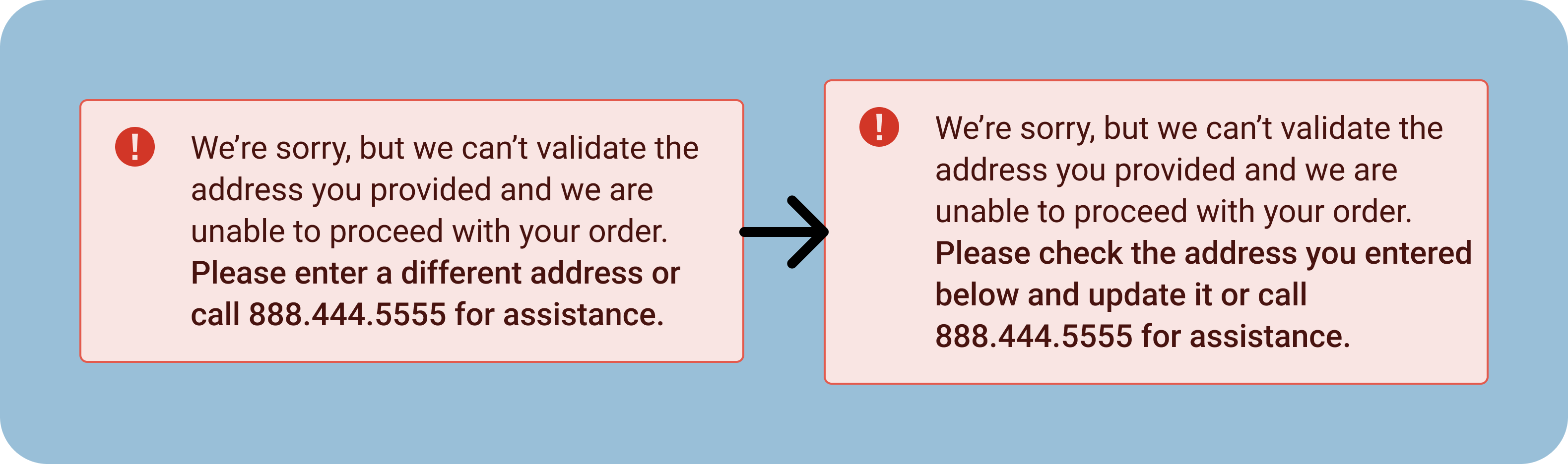
For the hard-stop validation error, we originally wanted to tell the customer to enter a different address into the form or call for assistance. After presenting this to stakeholders, we determined we could cover a wider range of errors if we asked them to check the address and update it. This would cover instances where the validation error was because of a simple typo.
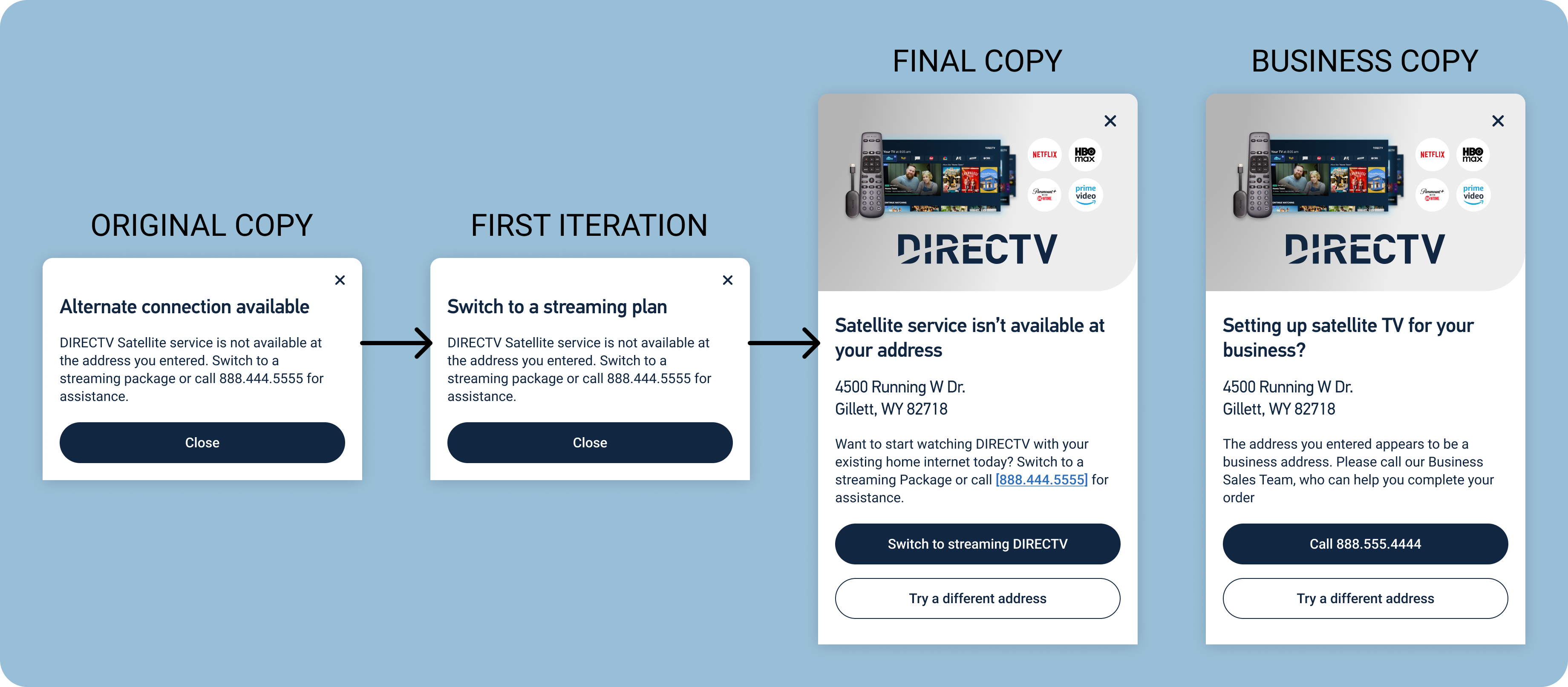
The modal advising customers to switch from a satellite order to streaming service started with very minimal copy. The first iteration was a simple change of the modal heading, intended to improve clarity for the customer in case they don't read all of the body copy. The second iteration was our final copy. This modal was redesigned to match a similar modal that had previously been used on the DIRECTV site. We updated the header again, added the address the customer entered, and made the body message more positive. We also added a call-to-action that would redirect the user to the same package they originally selected, but in the streaming flow instead of the satellite flow.
A last-minute addition to our story was an instance where the validation tools identified the customer's address as a business address. For this, we reused the same modal design, but modified the copy to push customers to call our Business sales team.
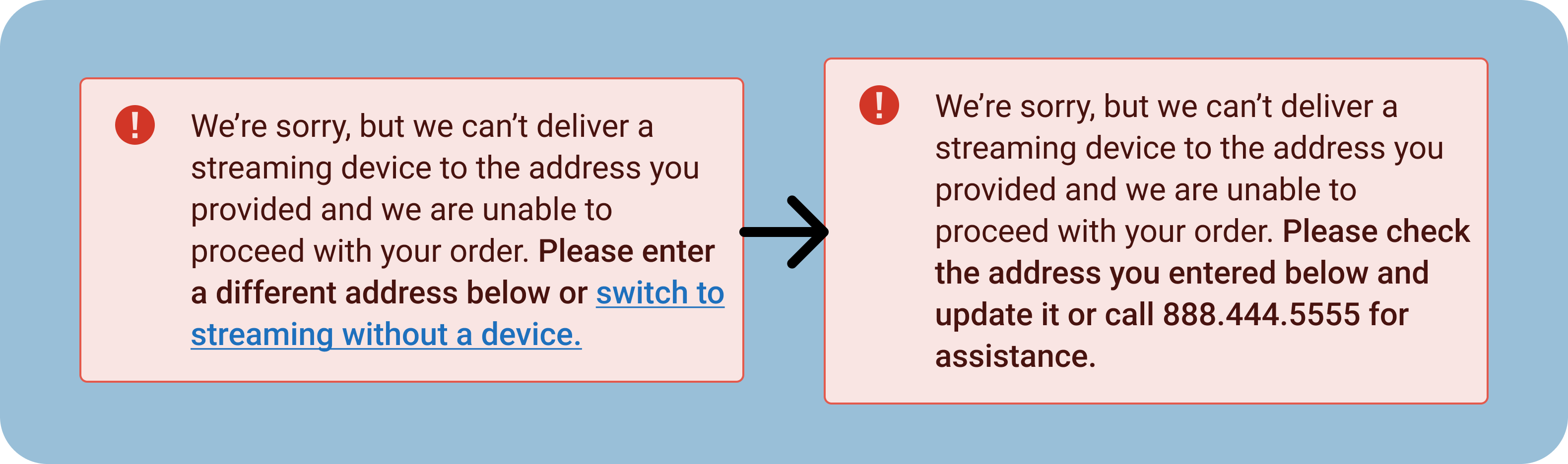
The third in-page error I originally wrote would explain to the customer that DIRECTV could not deliver to their address and would encourage them to switch to streaming without a device. Due to coding complications, and problems with customers missing certain offers if they were redirected using that link, the Product Owner and other stakeholders suggested that we abandon the link. I replaced it with similar language to our first in-page error and a phone number the customer could call for further information and assistance.
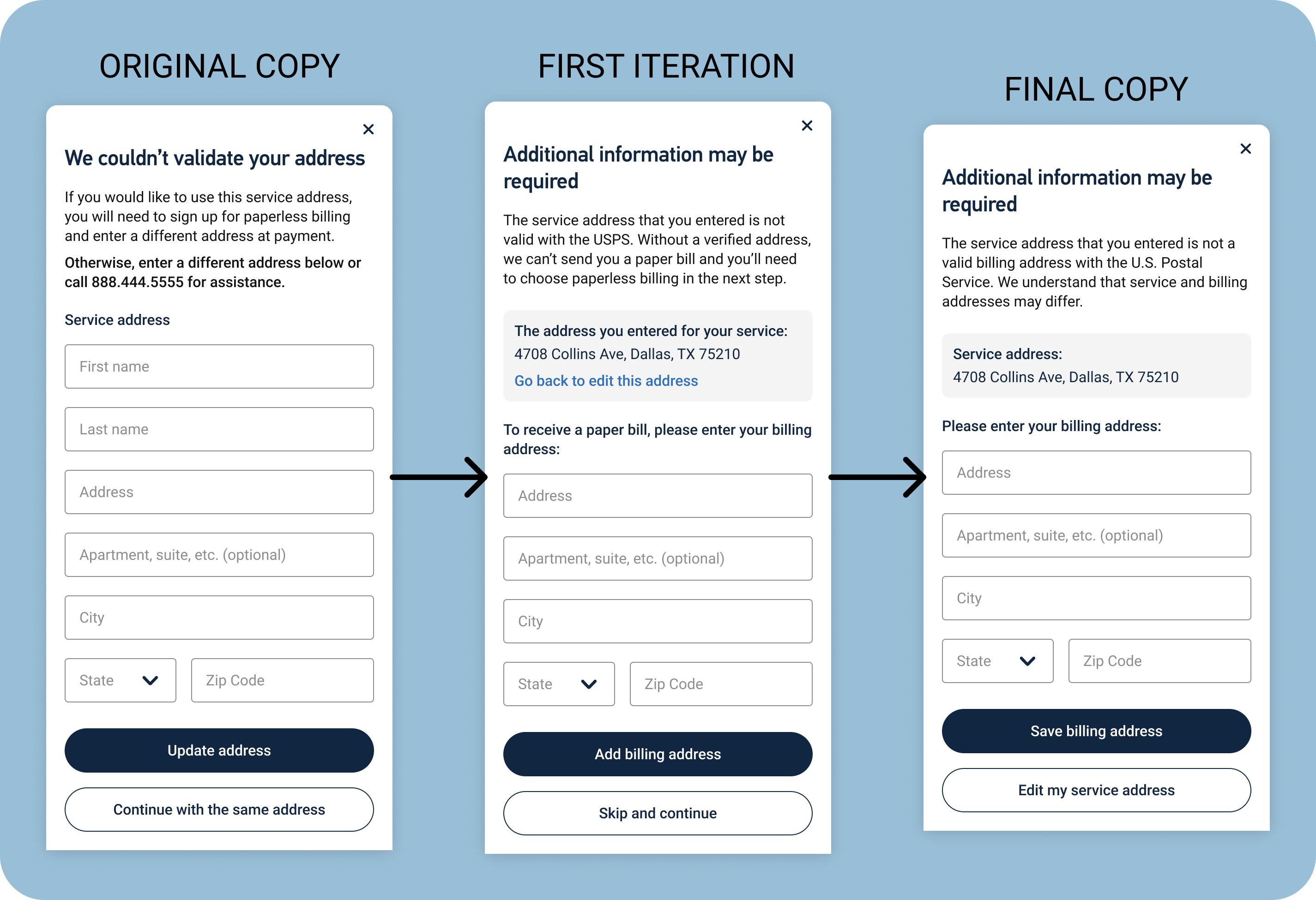
For some customers, their address would be valid everywhere except with the U.S. Postal Service. This meant that we could provide them with service, but couldn't actually send them any mail. In that instance, we'd need to have the customer give us a different billing address or sign up for paperless billing. Originally, I wrote the modal to give them the option to update their service address and pushed the new billing address to further into the checkout flow. After speaking to stakeholders and particularly development leads and the Product Owner, we determined that it would be better to collect the billing address immediately. The first iteration made a number of changes:
After making these changes, I presented this copy to a wider team of developers and to the UX designer assigned to this project. We determined that letting users skip adding a billing address here only to require it later in the flow wouldn't make any sense, so I updated the button copy to only allow customers to add a billing address or edit their service address. I also updated the body copy based on feedback from the Product Owner and to shorted that section. I removed the link below the service address, since the close icon at the top of the modal and the "Edit my service address" button both let the customer take that action already.
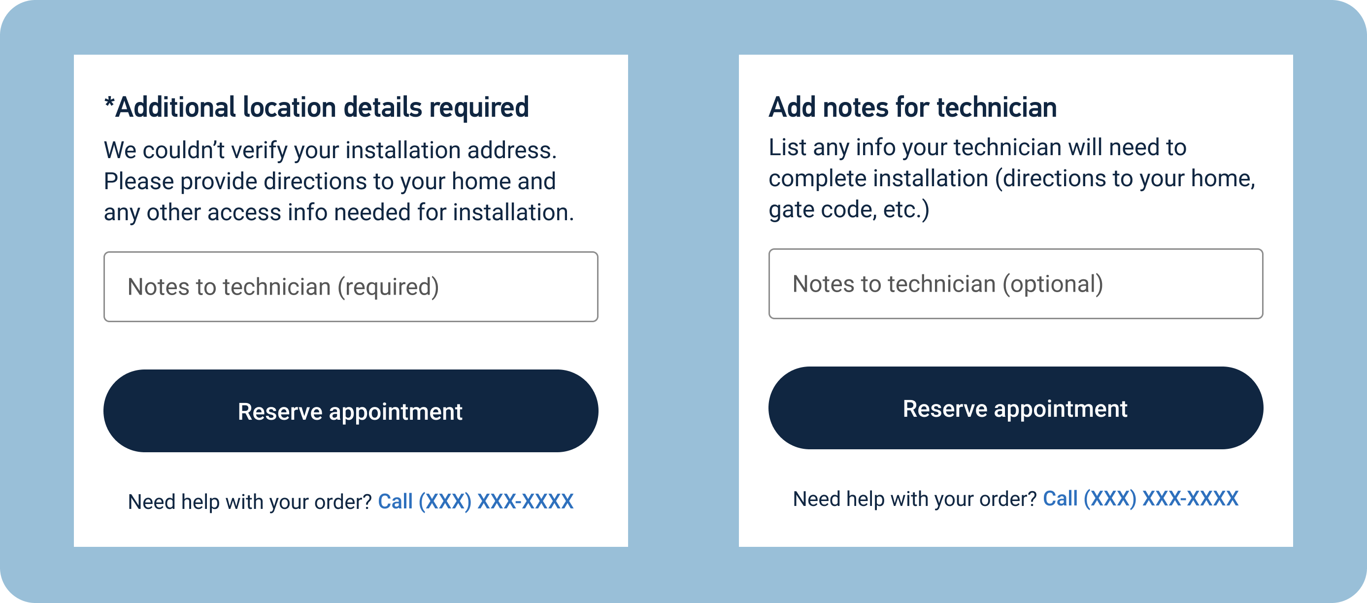
Customers whose addresses can't be validated with the U.S. Postal Service would need to provide details instructions to satellite installation technicians on how to reach their homes. Originally, this was a required form field that would only apply to customers who fell into this category. I drafted the copy to explain that we would need directions to the customer's home and any other pertinent information. I struggled a bit with this copy because we wanted to keep it as short as possible since it appeared at the very bottom of a form page.
After completing the initial draft, the UX designer and I agreed that it would be both useful and relatively simple to make the form field appear for all customers scheduling an installation, but we would need different copy when it wasn't a required field. For these customers, I removed the asterisk noting the required section, changed the field label to say "optional," and changed the body copy to explain what types information we might find useful.
At the time that my employment with DIRECTV ended, this content was being coded and put into production. It was very clear from the beginning of this project that it would only impact a small number of users, but I received positive feedback from the Product Owner, UX Designer, and development team on my flexibility in adjusting the content to changing requests and my ability to address multiple unique scenarios with relatively simple copy.
The design team received almost no guidance for this project. We were simply handed a list of error codes and their outcomes. From there, all of the information we received was because we routinely contacted the Product Owner and members of the development team to get clarification on their specific expectations and what would work best for them in adding these features to the website. If we hadn't consistently asked for clarification and feedback, we wouldn't have been able to complete this project.
Shortly after completing the content for this project, I was laid off from DIRECTV due to budget constraints. Because of that, I have been reflecting on costs to implement website changes like these. We had a list of 26 different scenarios for this assignment. By keeping the copy relatively vague and repurposing designs and copy to relate to multiple scenarios, the four sets of screens I shared above addressed all of those situations. Writing and designing with costs in mind doesn't allow for the most creativity, but it does help things move more efficiently, saves time, and can be a crucial part of working in a situation where budgets are being heavily scrutinized.