DIRECTV
Satellite Eligibility Checker
A location-based check to determine whether customers are eligible for satellite TV service and recommending streaming service as an alternative.

DIRECTV
A location-based check to determine whether customers are eligible for satellite TV service and recommending streaming service as an alternative.
As more and more people shift away from traditional cable and satellite tv to streaming services, DIRECTV experimented with preventing new satellite subscriptions in areas where the number of satellite subscribers was already very low relative to the total subscriber count and where streaming internet would be available at high enough speeds to provide customers with good service quality.
We need to check the customer’s service ZIP Code and then tell them whether they can sign up for satellite service. How can we:
We created two modals and a snackbar message for this flow: an initial location check modal, and then either a snackbar message confirming that satellite service is available or a second modal telling the user that satellite service isn't available and encouraging them to explore streaming options.
UX Writer - I drafted the copy for the modals and snackbar message. In this role, I partnered directly with a UX Designer and Producer, and worked with a Product Owner and other internal stakeholders to clarify the needs for this request.
Most DIRECTV UX writing is contained in Content Requirements Documents (CRDs). CRDs let writers add extensive notes including alt text, conditional formatting or display changes, and link targets. CRDs also let developers copy and paste content directly into code.
UX Designers create frames in Figma. Although I worked primarily in Microsoft Word, I also tested content in Figma wireframes for fit. Most content work in Figma is done prior to our first product demo to let stakeholders see what content we are proposing while they are reviewing the design.
We had very clear instructions from the beginning of what was required for this task: a modal asking the user for their Zip Code, and then another modal telling the user that satellite TV was not available in their area. We started with simple modals and copy that directly matched the request, which we then presented to stakeholders and interated upon.
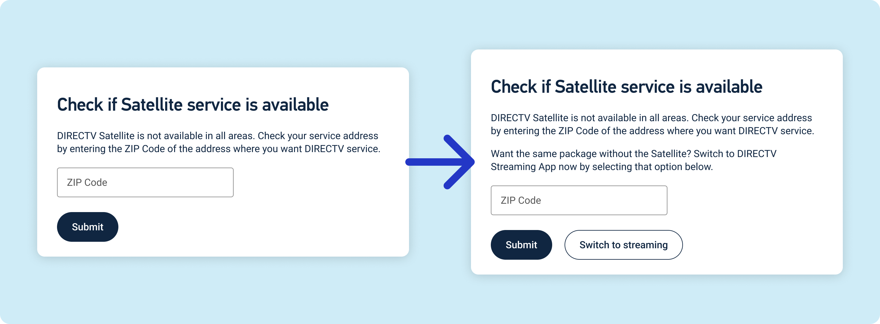
Our original modal only asked the user for their ZIP Code. After reviewing this with internal stakeholders, we decided giving user's the option to switch to a streaming package instead of checking for satellite service in their area could help increase the overall conversion rate of users who encountered the modal.
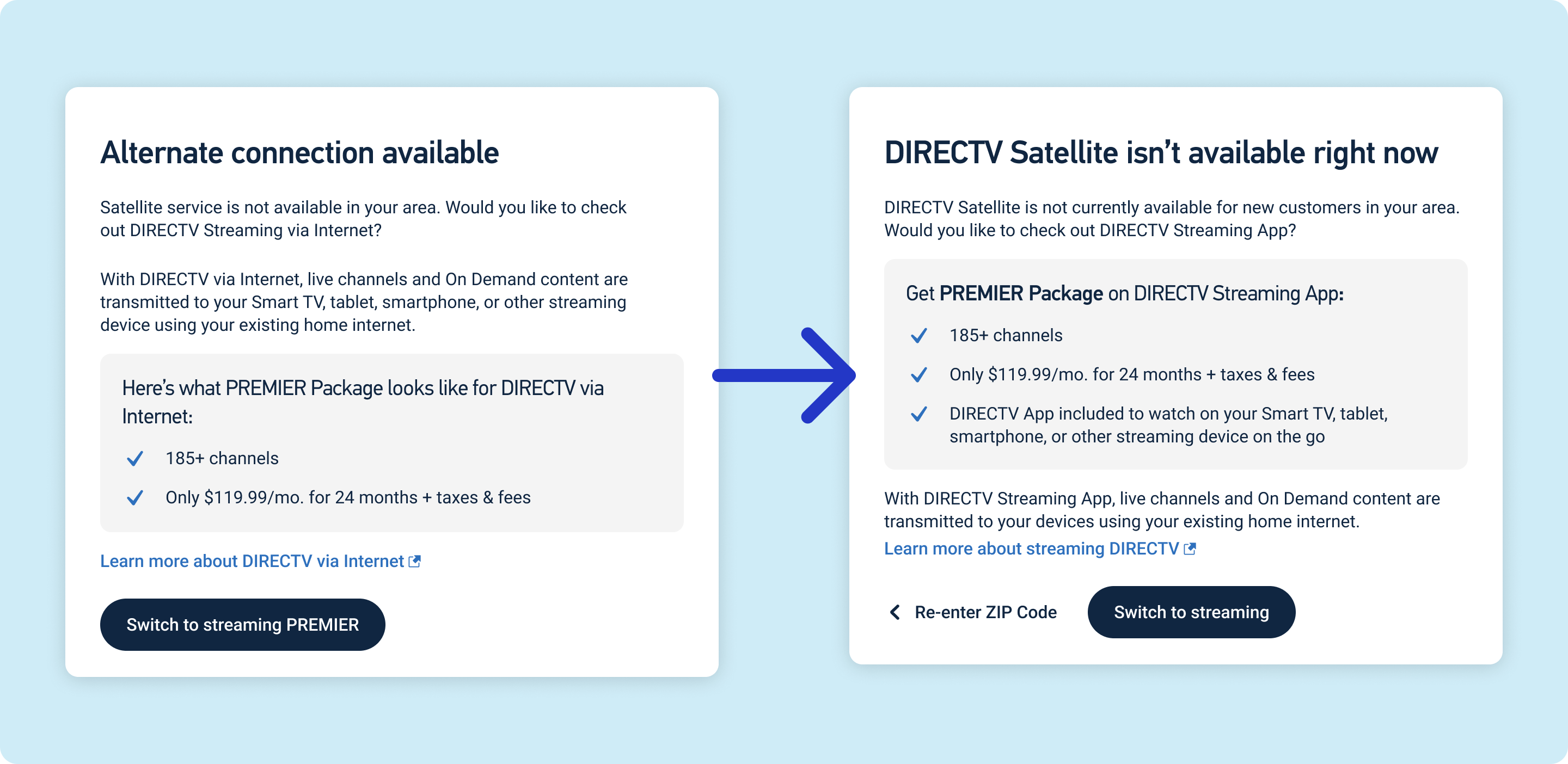
Our first Satellite Unavailable Modal answered the ask—it informed the customer that satellite service wasn't available and gave them the option to switch to streaming the same package. I also included a link to learn more about DIRECTV via Internet. After reviewing this initial copy with our stakeholders, I made a few key changes:
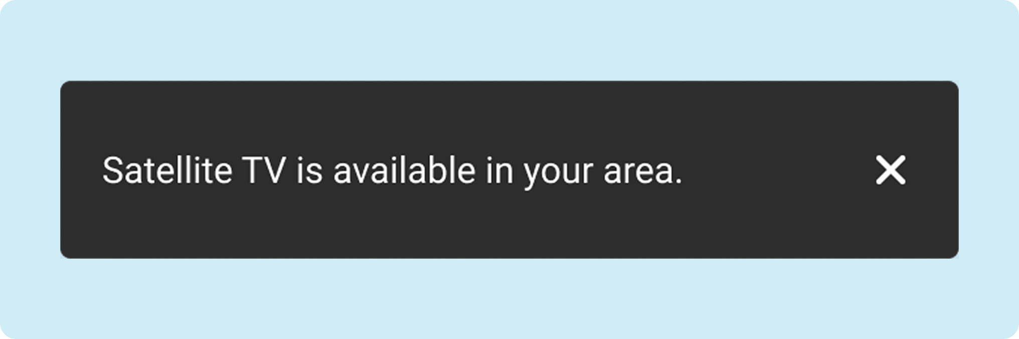
The initial request did not require any notice for users who are able to proceed with a satellite TV order. After speaking with our UX Designer and other stakeholders, we agreed that it would be good to add some sort of "clearance" or success message to let the user know the result of the ZIP Code check. This was a one-shot message with no iteration, which was based on similar messages in other flows.
This design was a beta test for future changes to the DIRECTV sales flow and is no longer active on the site. I was unable to obtain exact metrics for the effectiveness of this modal, but one of the key stakeholders for this project informed me that the project was a success. Our target recapture rate after transferring users to streaming packages was 10% of lost satellite sales. The stakeholder's estimate was that we achieved a 30% recapture rate, or triple our goal. If these designs and copy are reintroduced into production in the future, they will likely be very successful.
We didn't initially include a snackbar message for users who could continue their satellite order; these users fell outside the scope of the initial ask, and focused on the users who would be redirected instead. When something as simple as a seven-word sentence on a snackbar can cut confusion for an estimated 60% of users who run into the modal, it seems like a no-brainer to add that to the design. It also rounded out the design, keeping us from having a dead-end in our flow where we've just let the customer loose to the next step without giving them any explanation of what is happening.
In the more than three years I was at DIRECTV, I was repeatedly told that "people don't read." We put the most significance on headings because they stand out, and try to keep important details out of body copy. When you have a lot to say, it's important to break the copy into chunks by adding subheadings, bullets, or even just rearranging body copy around other copy, like I did in the Satellite Unavaiable modal iteration. A wall of text is intimidating; chop it up whenever you can.