DIRECTV
MyFree DIRECTV Signup & Login
A series of screens for new and returning users trying to gain set up an account with MyFree DIRECTV or to log in after having previously created an account.
DIRECTV
A series of screens for new and returning users trying to gain set up an account with MyFree DIRECTV or to log in after having previously created an account.
Late in 2024, DIRECTV rolled out MyFree DIRECTV, a free streaming service compatible with the DIRECTV app and DIRECTV streaming devices. In partnership with a UX Designer, I was tasked with writing content for the MyFree DIRECTV signup flow. This included five different scenarios:
How can users easily sign up for and start using MyFree DIRECTV after they enter their email address on the MyFree DIRECTV landing page?
For all of these scenarios, we've already received and validated the customer's email address, so we know which scenario they fit into. Some of the screens we designed and copy I wrote were reused across scenarios. In the end, we created three main screens: login, signup, and welcome.
UX Writer - I drafted the copy for the sign up flow. In this role, I partnered directly with a UX Designer and Producer, and worked with a Product Owner and other internal stakeholders to clarify the needs for this request.
I did most of my UX writing for DIRECTV in Content Requirements Documents (CRDs). CRDs let writers add extensive notes including alt text, conditional formatting or display changes, and link targets. CRDs also let developers copy and paste content directly into code.
UX Designers create frames in Figma. Although I worked primarily in Microsoft Word, I also tested content in Figma wireframes for fit. Most content work in Figma is done prior to our first product demo to let stakeholders see what content we are proposing while they are reviewing the design.
To determine the content and design needs for this assignment, we combined scenarios 2-5 into an "existing user ID" category, which helped us to identify the three main screens needed for this flow: a signup screen, a login screen for existing users, and a welcome screen for users after the sign up or log in. After these pages were completed, we were tasked with an email validation flow and a screen requesting additional information from some returning customers.
After a customer entered their email on the MyFree DIRECTV landing page, users with no previous interaction with DIRECTV would be taken to a signup screen.
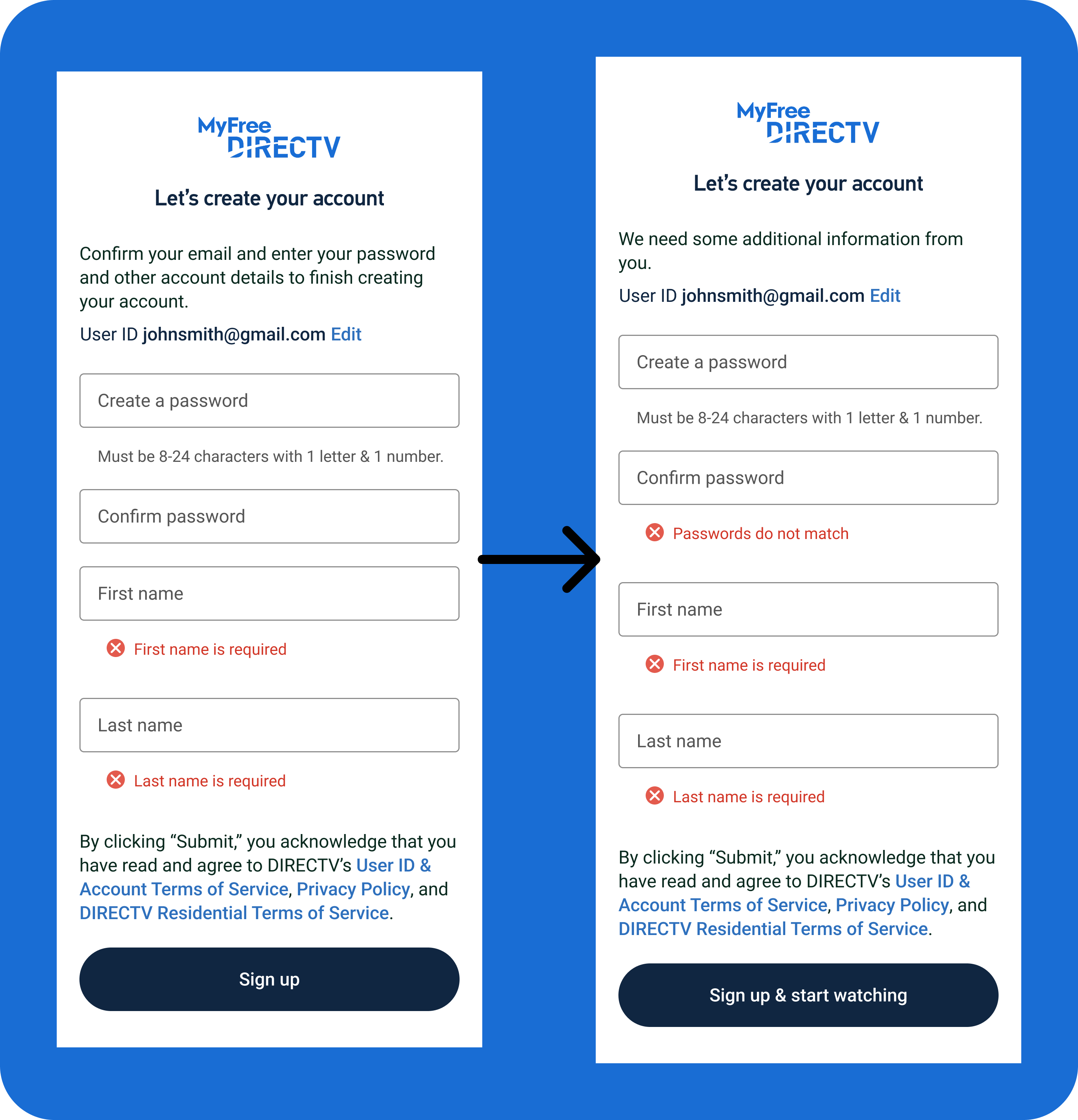
After creating a first draft, I updated the body copy at the top of the modal to remove the list of items needed. The customer would see this as they fill out the form, so it was just wasted space. I also added an error message for password mismatch. Finally, I updated the button copy to include "& start watching" to indicate how short the signup process is so that the customer knew what to expect after this screen.
Returning customers, existing customers, or users who had previously set up a DIRECTV user ID and password but not finished their order would be taken to a login screen.
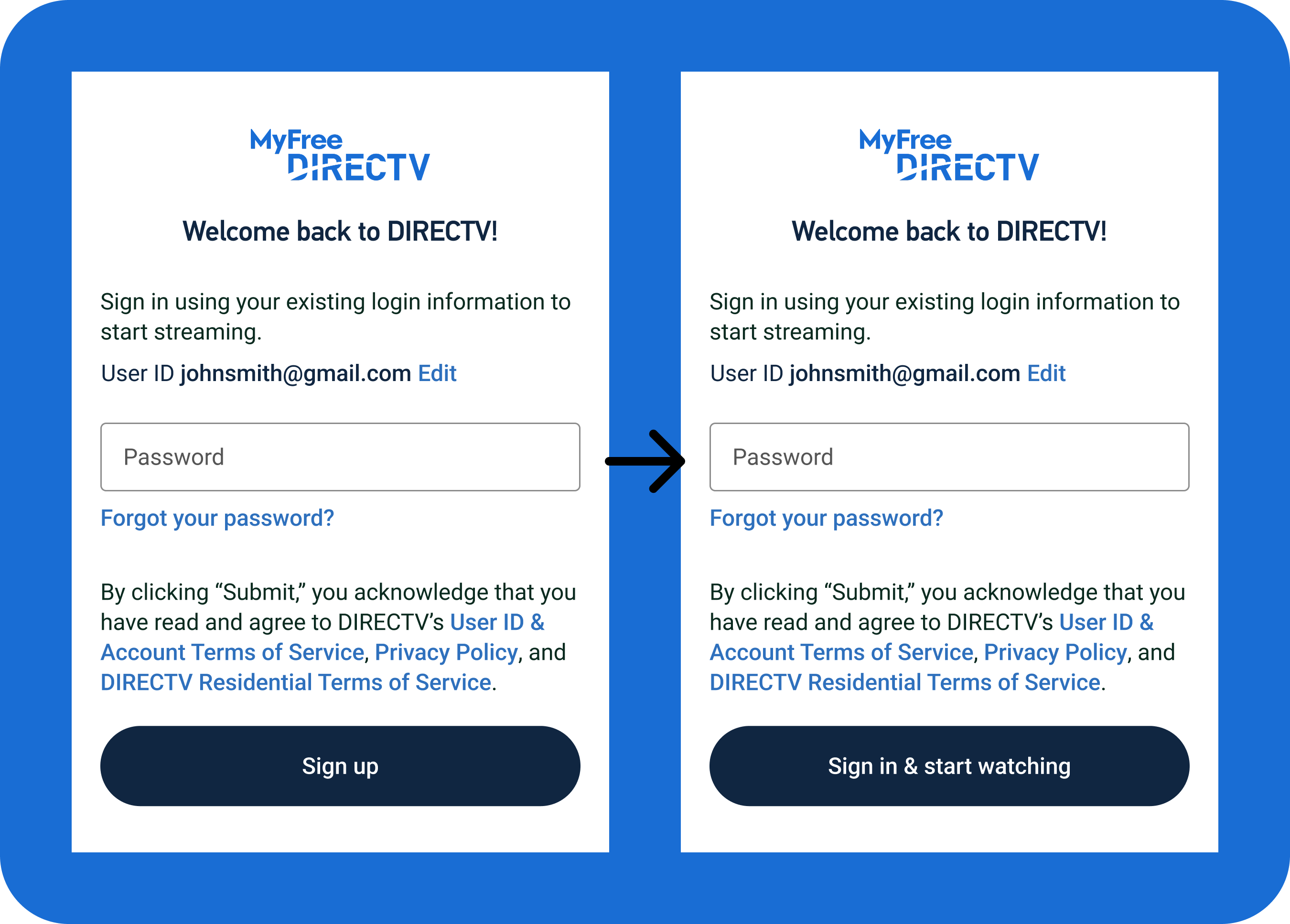
After my first iteration, the only required change to the login copy was updating the button text, since customers weren't signing up and we wanted them to know they'd immediately get to start watching after the next screen.
After a customer signs up or logs in for the first time, they are taken to a welcome screen which will serve as a jumping-off point for users before they start watching MyFree DIRECTV.
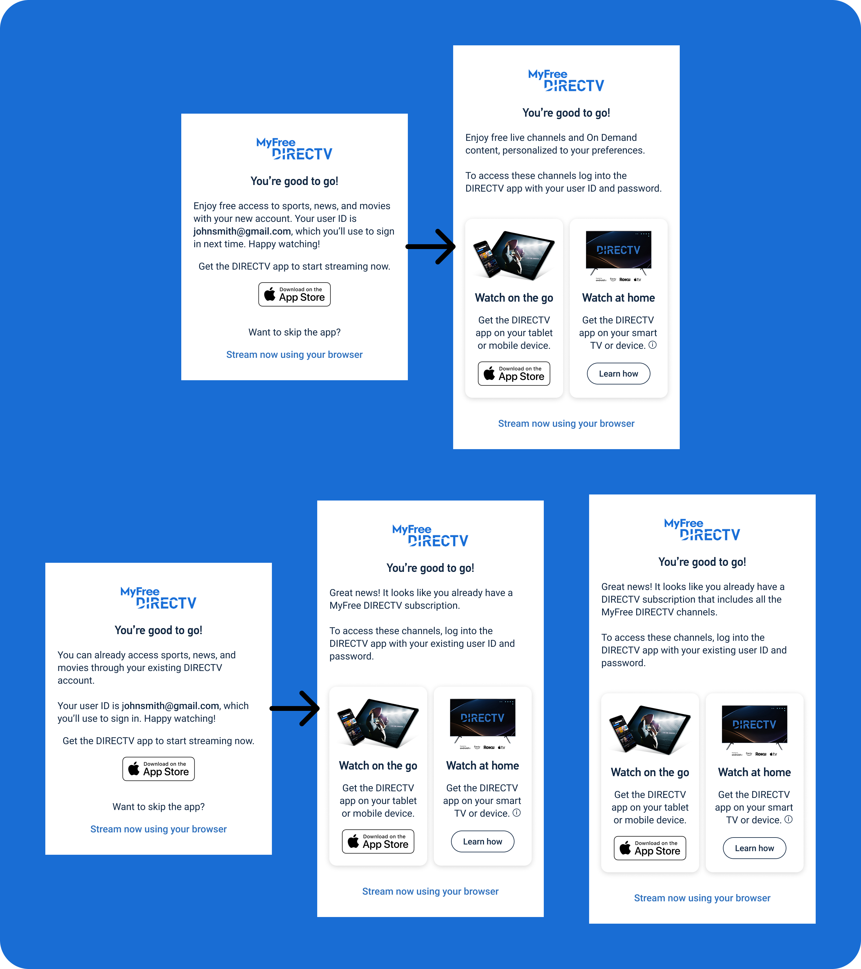
The first set of copy for the welcome screen had different body copy for new users versus customers with an existing user ID. After reviewing the initial drafts for both screens and speaking with stakeholders, the design changed to include instructions for downloading the DIRECTV app on the customer's TV or other device. I also separated the existing user screen into a screen for returning MyFree DIRECTV users and returning DIRECTV users who were new to MyFree DIRECTV.
Some customers who enter their email on the MyFree DIRECTV landing page need to validate the email address they provide, as our system wouldn't be able to tell if they were new or returning users. Customers would receive a one-time pin, need to retrieve and enter that pin on the validation page, and would either be taken back to signup or login page or would be blocked from continuing with the email they provided. For this flow, we used existing content as a rubric, meaning there wasn't any clear iteration stage, but content required included headings, body copy explaining the issue and the validation process, error messages, field labels, and button copy.
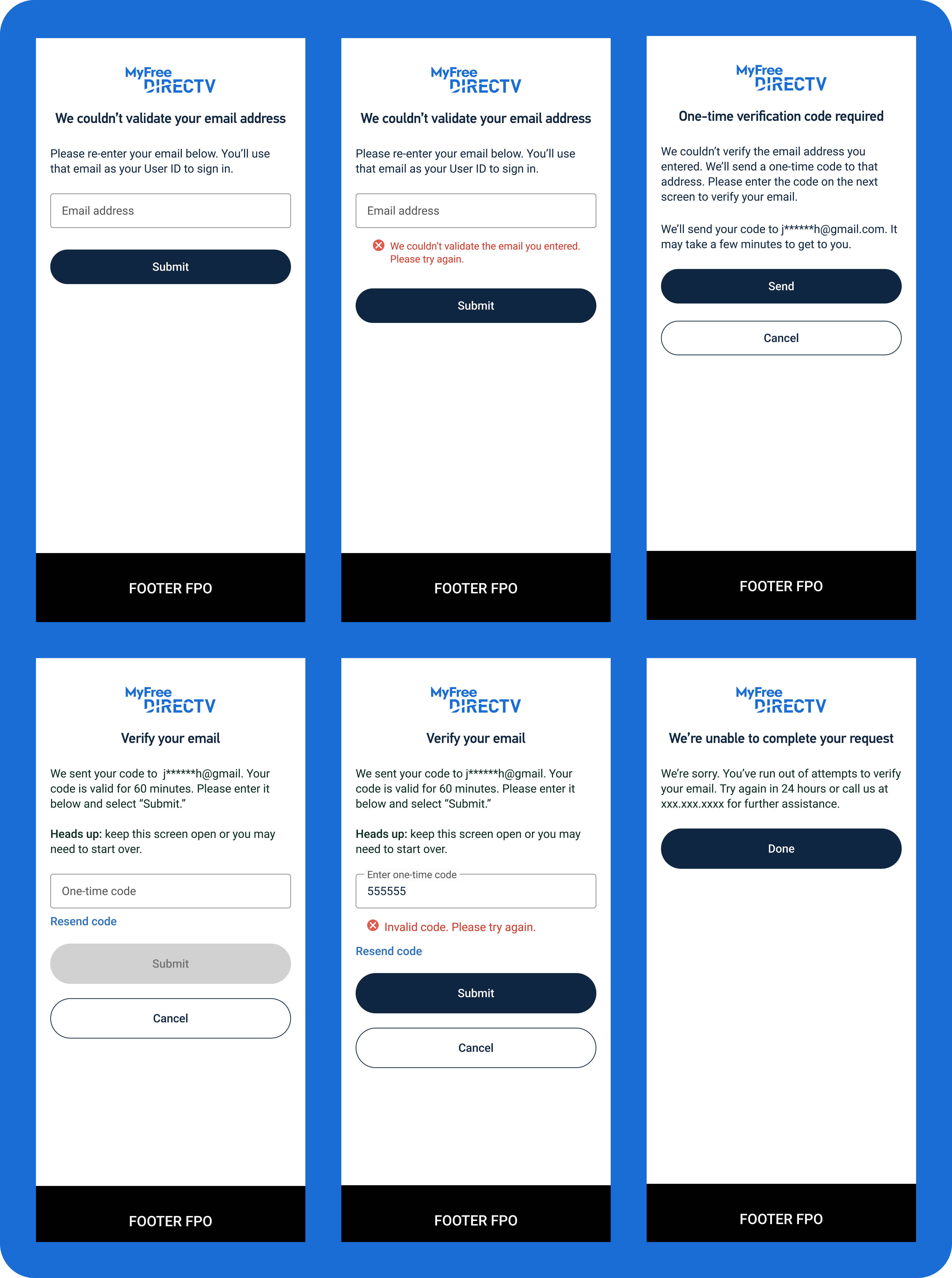
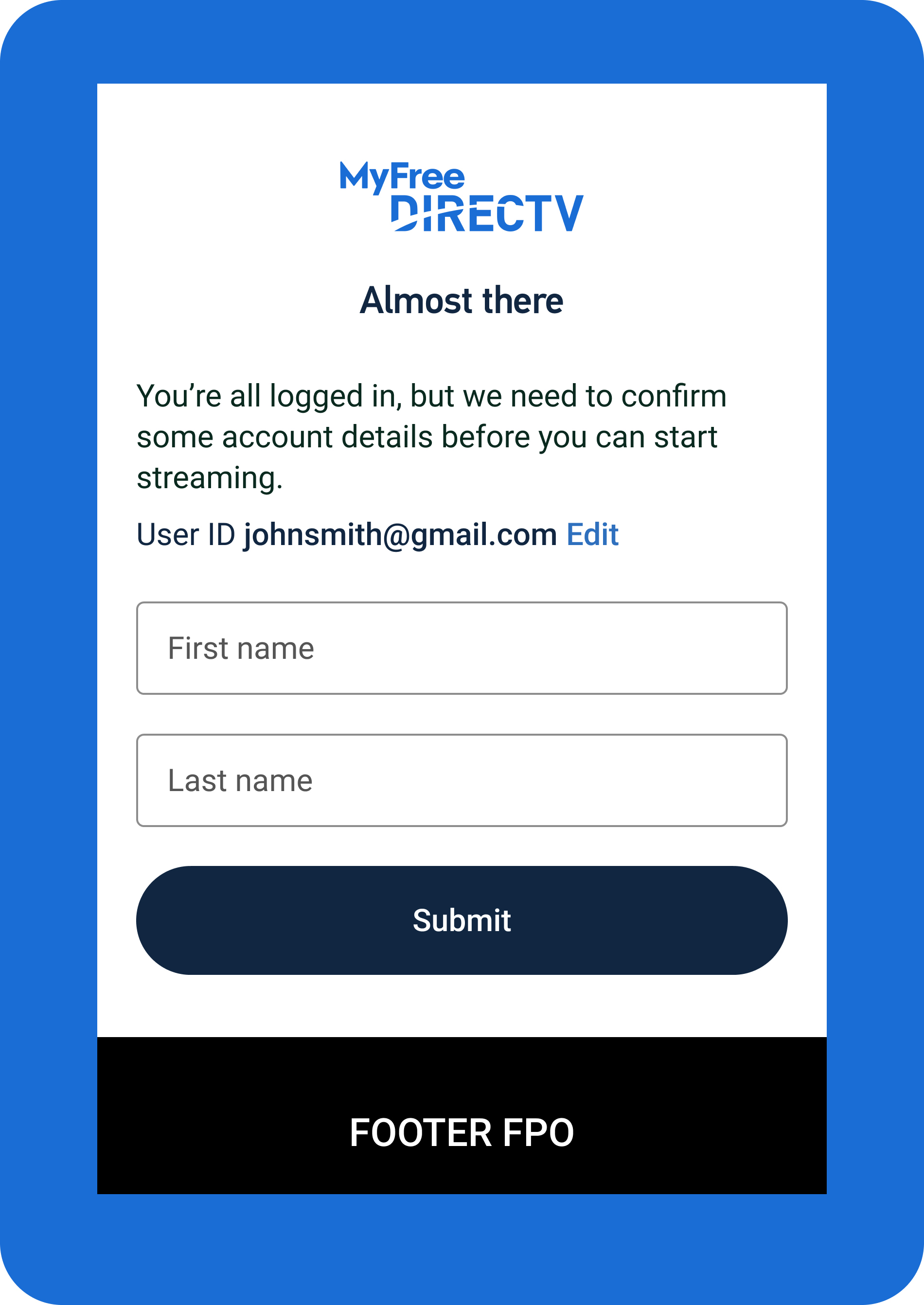
A small number of users who sign in with an existing user ID and password would need to provide additional information. Specifically, their first and last name are missing from their account profiles. To collect this information, we added a screen asking just for the customers name. This screen was relatively simple and did not have any iteration after the first draft.
MyFree DIRECTV launched late 2024 and grossly exceeded expectations. Our initial goat was a 2-5% conversion rate, but initial conversion was 10%. By third quarter 2025, we were still 20% over the expected conversion rate. This massive success has resulted in 18% higher ad sales revenue, 23.5% higher sales upsells, and 30.7% higher add-on upsells from MyFree DIRECTV users.
MyFree DIRECTV has functioned without any additional content iteration since late 2024, and continues to show promise as a way to bring additional users into the DIRECTV umbrella. I would like to think that an easy signup process is partially responsible for its success.
We opted for a very simple, two-screen flow for signing user's up for DIRECTV. We didn't want to stand in the way of their access to the streaming content, and wanted to encourage customers to start watching as soon as possible. Because we didn't split the signup process into more pages and smaller, individual steps, there was less opportunity for the user to abandon the flow, which in theory contributed to the high conversion rate. Fewer steps means fewer chances to lose interest.