DIRECTV
DIRECTV Sports Pack
An update to the in-tile add-on description for a popular DIRECTV sports bundle to improve readability.

DIRECTV
An update to the in-tile add-on description for a popular DIRECTV sports bundle to improve readability.

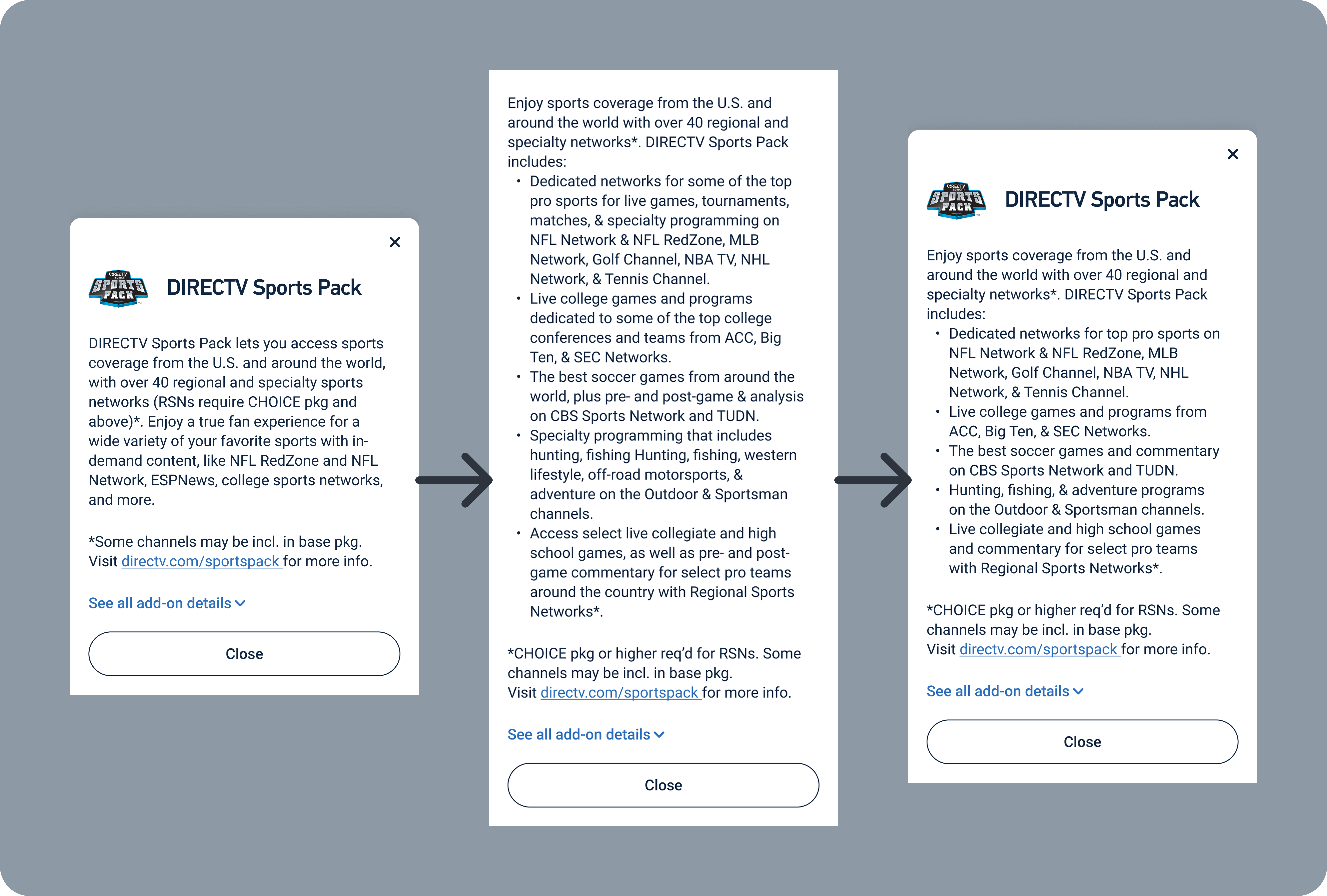
DIRECTV Sports Pack is one of DIRECTV's most popular package add-ons, but recent sales of Sports Pack had not kept pace with expectations. While reviewing our add-on tile design, our senior UX Designer noticed the massive paragraph of text our users would have to read to get just some of the features that Sports Pack offered. He asked me to retool the language to make it easier to digest, but also asked me to include all of the features of the add-on. This meant a potentially massive amount of copy that no user would ever read.
How do I provide users with a complete list of Sports Pack's features on a single mobile screen without scrolling, while still making the description easy to read.
I took an extensive list of features and grouped them into 5 key bullets. After reviewing the bullets with our marketing team, we were able to transition from 9 lines of vague copy to 17 lines, broken into bullets, which gave users specific features and channels.
UX Writer - I drafted the replacement copy for the modal, and got approval for the replacement copy from our UX designer and the marketing leads involved for this product.
Most DIRECTV UX writing is contained in Content Requirements Documents (CRDs). CRDs let writers add extensive notes including alt text, conditional formatting or display changes, and link targets. CRDs also let developers copy and paste content directly into code.
UX Designers create frames in Figma. For this project, I worked primarily in Figma to draft content so I could continually test it for fit.
I started by looking at the content we had used in other places on the DIRECTV website to describe DIRECTV Sports Pack. I was able to leverage category breakdowns on other pages of the site to serve as starting points for the bullet content in the tile. In order to keep the tile to a single mobile viewport without scrolling, I cut some descriptions down and combined others. I presented the updated format to the senior UX Designer who asked me to work on this, and with his approval and the approval of our Offers team, I was able to submit the change to our development team.

Unfortunately, because of budget constraints and a lengthy development backlog, this content change did not go into production. Before leaving DIRECTV, I reminded the Product Owner with the most control over Sports Pack that this content had changed and it would be good to bring it into production as soon as possible.
Adding 8 additional lines of body copy to a tile goes against key content strategy for DIRECTV sales, but being able to turn a tile that didn't really tell the customer something in a single long paragraph into a bulleted list that gave them a clear breakdown of features was worth it. Less is typically more, but sometimes more can be more in the right circumstances.
It wasn't until I was reviewing my work over my time at DIRECTV that I realized several months had passed without this content change being implemented. I'm glad I wanted to include this in my portfolio; if I hadn't, I don't know if the content change would ever reach production. It still might not get there, but at least I can push it along before I leave.