
Educational bootcamps are an increasingly common choice for adults to make career pivots amid the responsibilities of daily life. Our team of 5 designers found that students spend a considerable amount of time navigating between their student portal and other platforms to find necessary resources. This inefficiency is an ongoing, unwelcome tradeoff that results in too much time on navigation/organization/administration instead of core learning tasks.
The question then became: “How might we integrate a hub in the portal for all UX resources shared so that students can spend less time searching for a resource, and more time and energy on the learning process?” We also recognized the competitive advantage of a one-stop communication tool that houses resources, eliminating the need for multiple platforms.
For this 3-week design sprint, I primarily focused on a single task, which was coding a simple mockup of our design in bootstrap. I also partnered with the other designers in conducting research, defining our problem, ideating our solution, and creating low-fidelity wireframes.

We chose a three-prong research approach that consisted of 1:1 Interviews, a 19-question survey, and a semi-structured focus group. Due to the short time frame we narrowed our research pool to members of our current UX/UI Bootcamp. Some of the findings were specific to how the course was taught, such as matching the homework due dates to what they learned that week, rather than feeling behind. We realized that was too course specific, and focused on the following findings for our education portal instead:
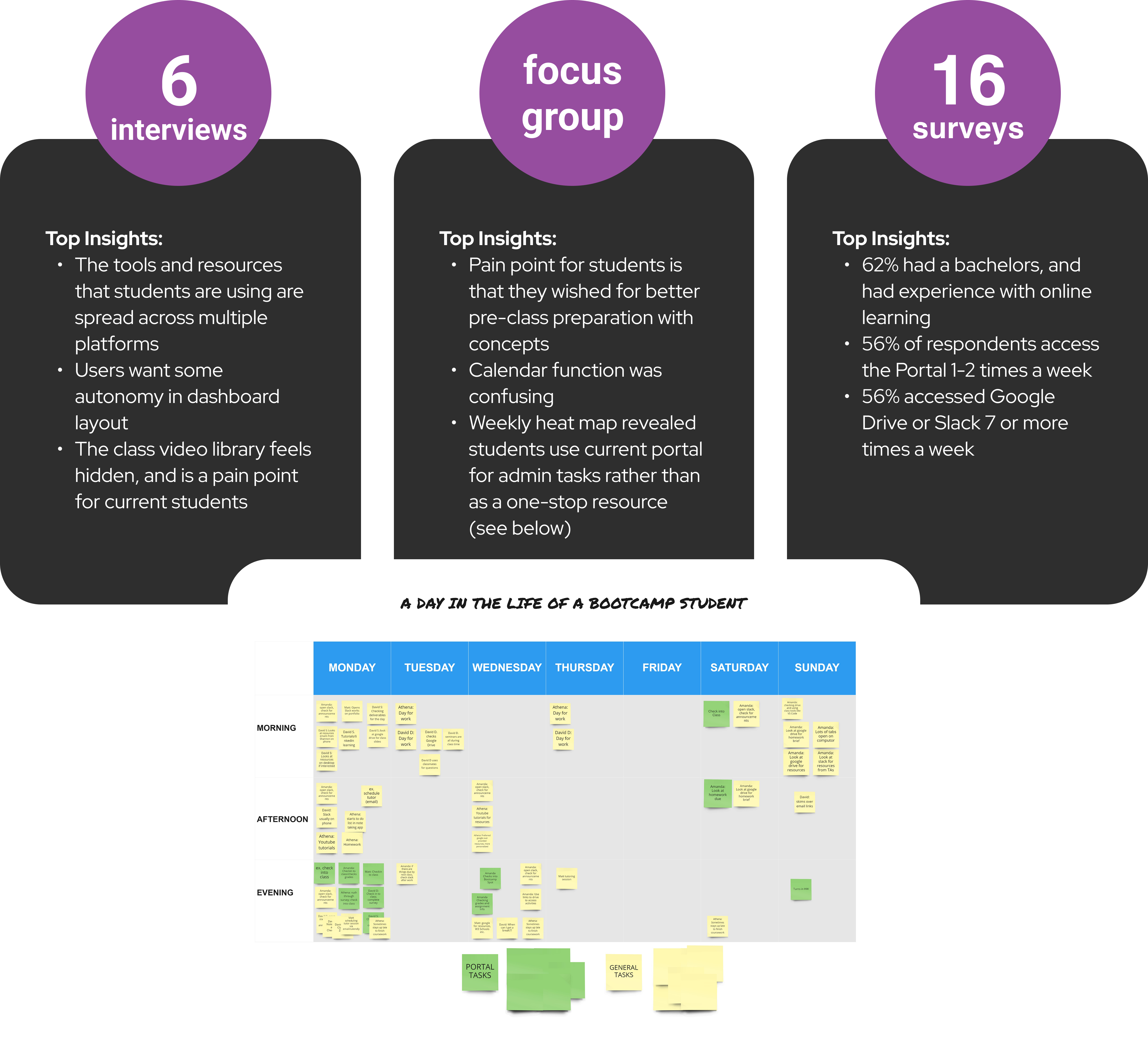
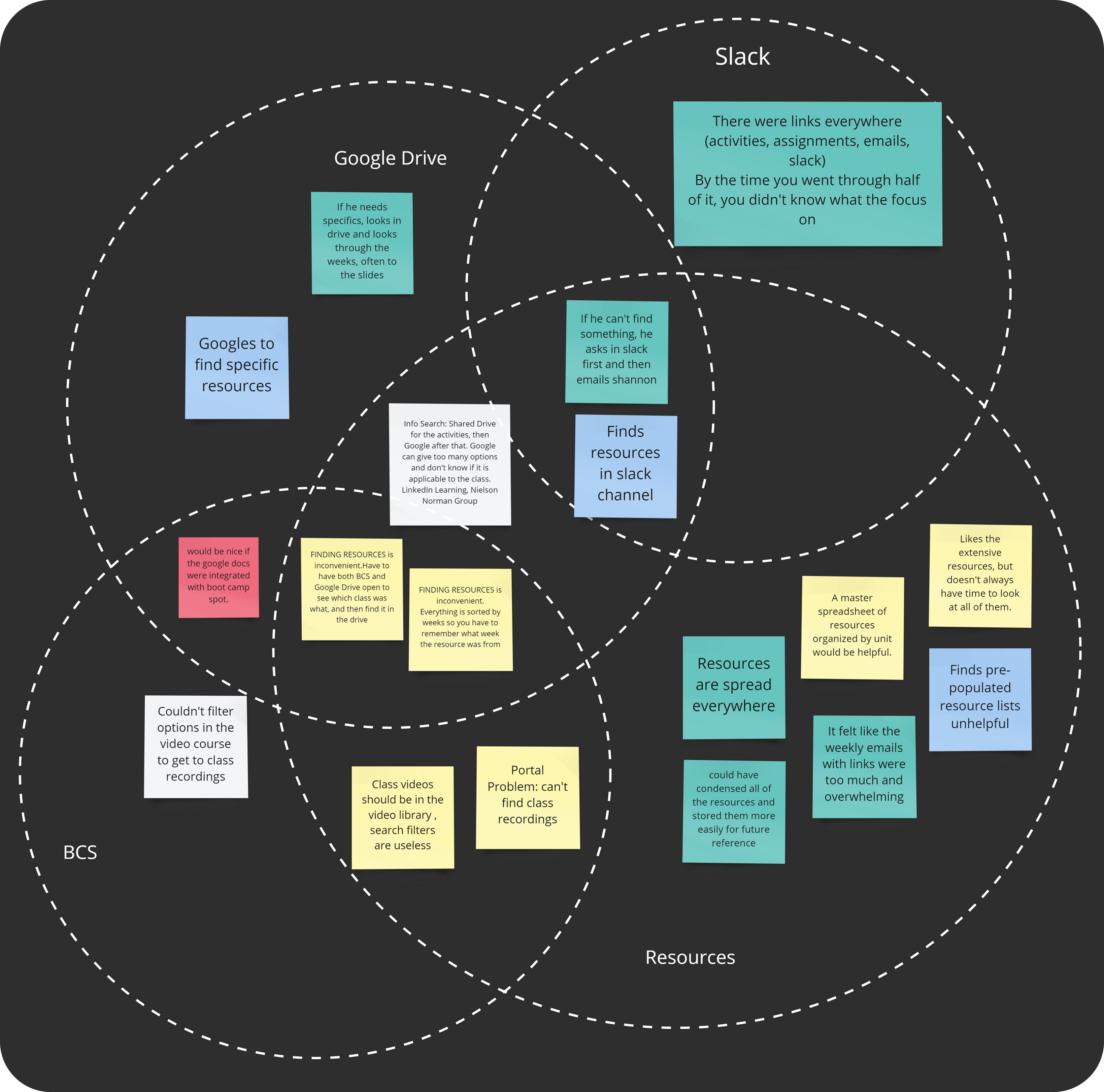
We synthesized all feedback into an affinity map, where we quickly realized that students rely on other technology channels besides the portal for their current class. This reduced the portal for students to merely an administrative function that added little value to their overall learning.
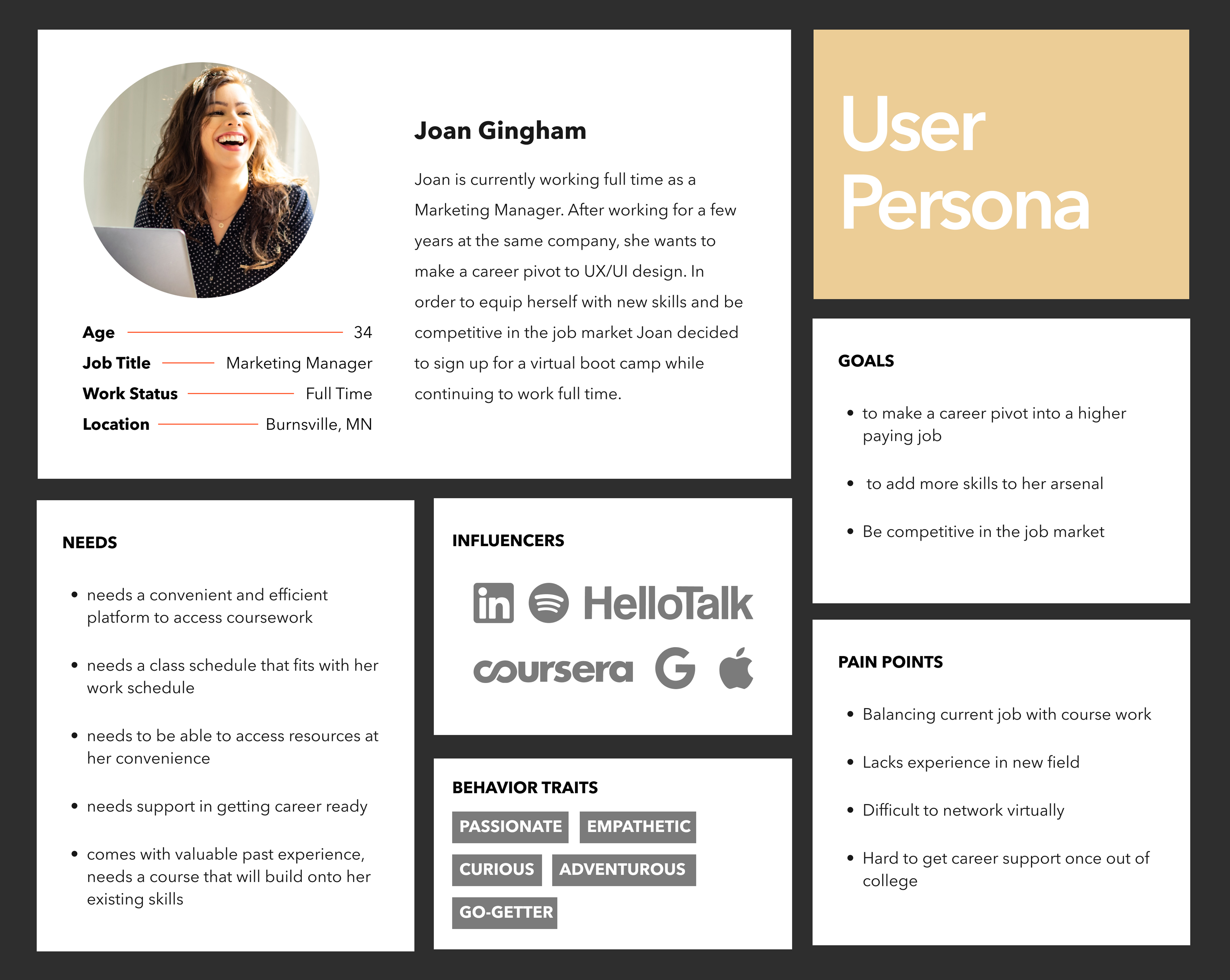
Meet our user, Joan! We created a story board of a day in the life of this busy professional. As she researches concepts shared in class, she is able to navigate the helpful course materials tab to find relevant instructions. She is also able to share a helpful article she found online to her classmates in the same portal space. This is the kind of streamlined learning process she needs as she balances school with her full time job.
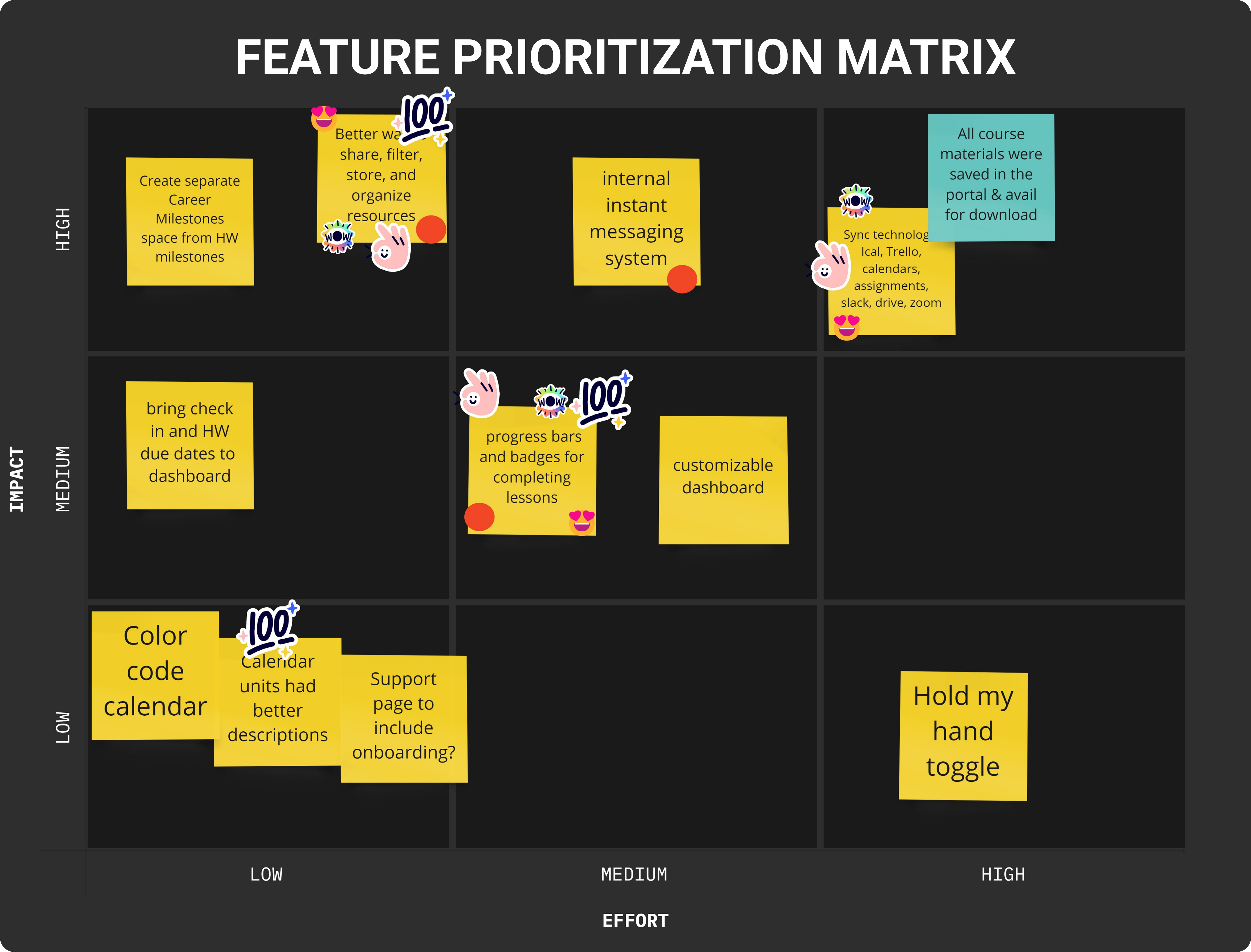
We brainstormed many ways to make the learning process efficient for Joan, through the following activities:
Our top two choices to focus on for dashboard features were:
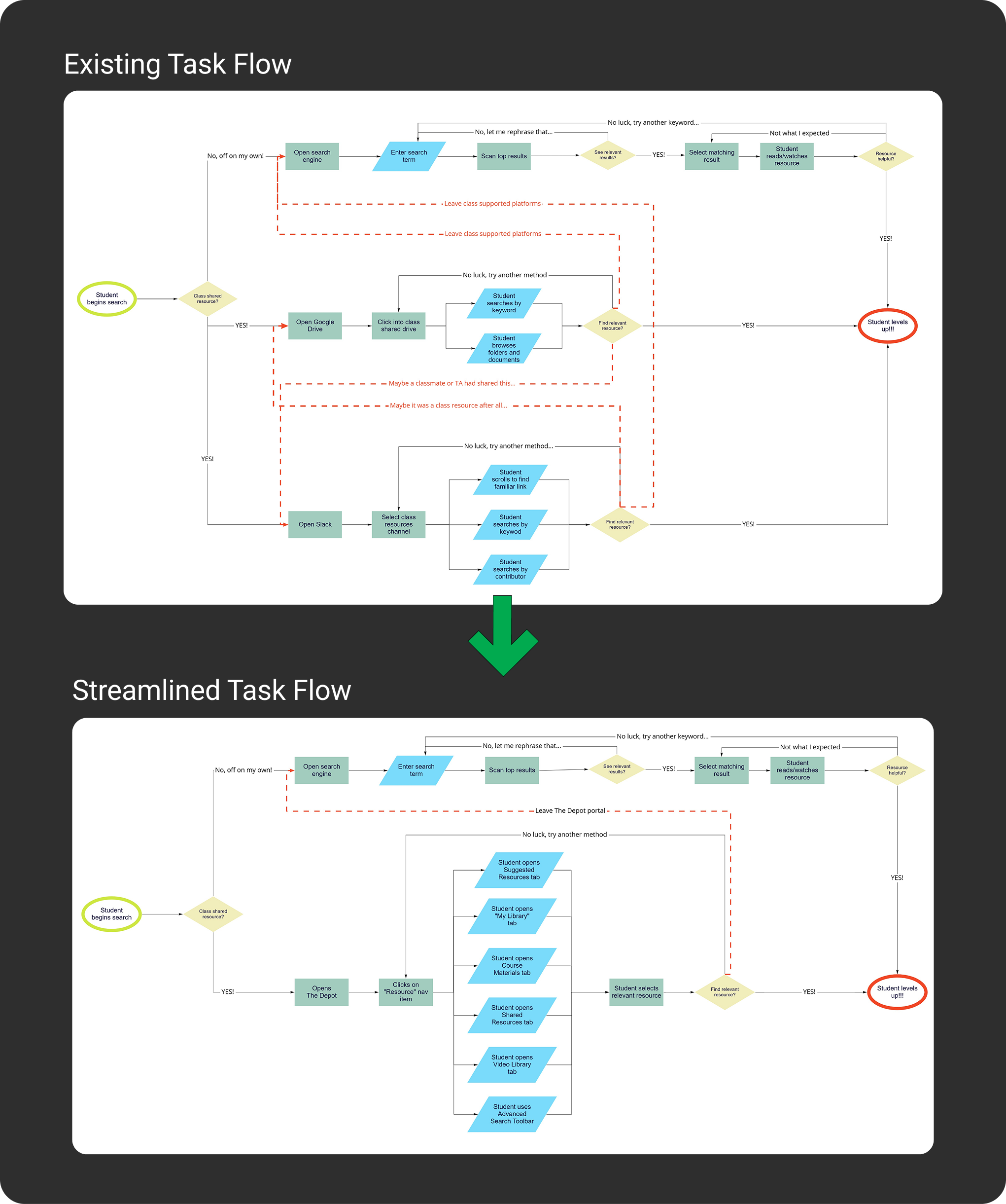
We drew on our own experience and frustrations when searching for resources to create an existing task flow.
As you can see, Joan wastes a lot of time trying to find resources in multiple platforms.
In our reimagined task flow, we created a single place to replace the need for external platforms like Google or Slack. Now Joan knows if it is a class resource, she can find it in the efficiently organized Resource tab on the Depot platform.


As we moved into the prototyping stage, we submitted sketches and redlined inspiration dashboards for components to include. Our primary focus was creating a one-stop platform for all the resources Joan will need during her bootcamp.
We held many discussions about the resources page, as that would be the hub that would make Joan’s educational experience a success.
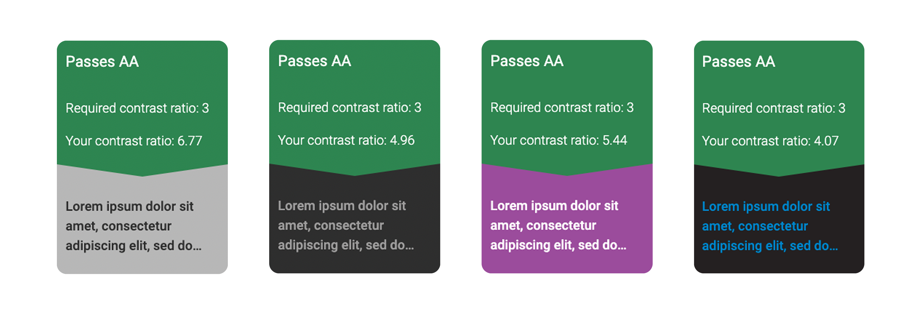
As we ramped up fidelity, we wanted to ensure that the background/foreground combinations of text and color met accessibility standards. We chose to test navigation as well as content labels, and our results gave us a green light to move forward with the current design.
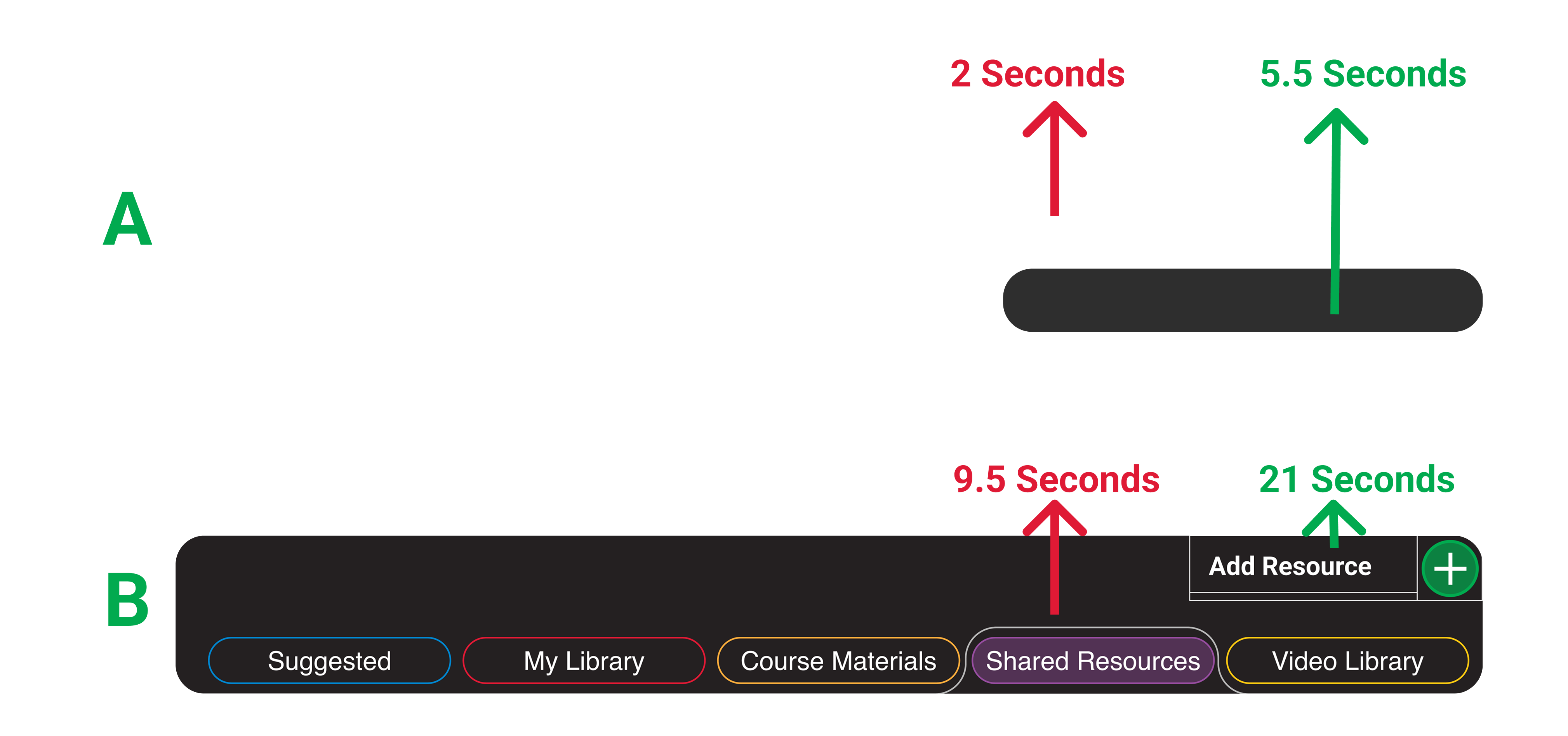
As we focused our design on a clearly organized tab structure to make Joan’s experience effortless, we took time to conduct A/B testing on our navigation design. We timed users as we asked them to complete two tasks:
We conducted a round of testing on our mid fidelity mockups and gleaned some great insights! Here is what we were able to address:


While there are typically few prerequisites for a bootcamp education, students bring a variety of foundational skills and experiences.
To provide a personalized learning experience, we added a skills assessment that recommends relevant resources throughout the course.
We envision this as an assessment that can be tweaked as Joan gains confidence in her skills, prompting better recommendations for higher level resources.
We decided at the outset of this project that the best choice for quickly coding a dashboard website would be to use Bootstrap 4. We were familiar with Bootstrap and knew that its row and column build style would be both the fastest way to build a function webpage and the best way to facilitate responsive web designs.
To date, we have coded the login page, our site dashboard with included skill assessment modal, and the resources page with five different content tabs.
Our coded site includes custom check boxes, drop downs, input boxes, tabs, cascading accordions, and a modal form, among other components.

With future development, the amount of code needed to fully realize our design could easily exceed tens of thousands of lines of code. Check out our code.

While our course was completely online, our group was fortunate enough to meet in person! We communicated extremely well over Slack and Zoom, keeping an open, collaborative environment throughout the project. It was because of this intentional community building that we were able to produce a well documented and researched project, and become friends in the process!
There is so much left to explore with this portal! With so many features to build out we want to make sure we focus on the ones that will make the most sense to Joan, without overwhelming her with superfluous features. These are what we are most excited to pursue next:
Build interactivity to bring Joan to resources used and shared that day. We also want to explore the idea of syncing with personal calendars.
Joan will value a simple, well organized platform to aid in her career pivot. We want to build a page that includes a career progress tracker.
We would love to test light mode versus dark, advanced search button placement, and the interactivity for the skills assessment results.
One thing we discussed was a whole other side of the portal dedicated to the instructors. This will entail another round of research and testing.