The natural beauty of Minnesota is one of its greatest assets. Oak savannah, coniferous forests, and deciduous woods filled with lakes and streams, teeming with fish a wildlife.
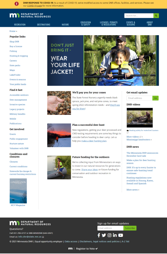
The Minnesota Department of Natural Resources currently has a website that is, at best, functional. As a team, we wanted to redesign the site to leverage images of the natural beauty this state has to offer, while at the same time making the site less confusing for visitors. We wanted to fix a number of accessibility issues, and to highlight accessibility within the content of the site itself.
As Visual Designer, I designed all of the cards, the footer, the Accessible Outdoors, Club, and Mission pages of the webpage, and designed the mobile and tablet site layouts based on our desktop design.
I designed out navigation dropdowns and built out the prototype for both our desktop navigation and mobile accordion menu.
Working with the other members of my team, I performed card sorting and built a sitemap based on our results which we used to build our site navigation.
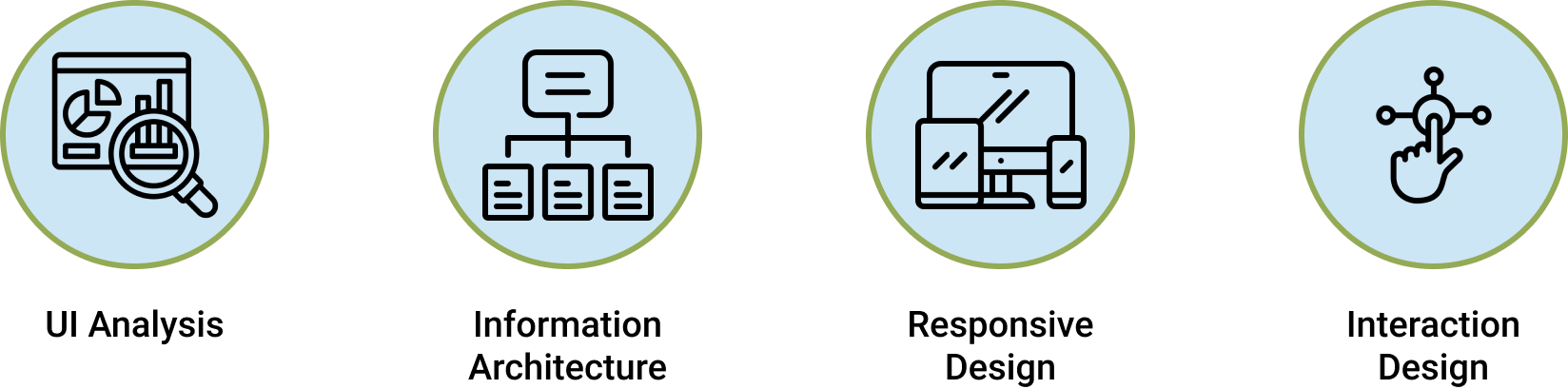
I conducted user tests of the original site, performed a heuristic analysis, and conducted competitor analysis as part of our research process.
I performed three different remote usability tests of our mobile site that informed our design iterations.
My design team set out to redesign a government agency website. We started with a short list of websites to choose from. Among those were:
After looking at all three choices, we chose the Minnesota Department of Natural Resource. Considering the subject matter of the site, it was the least visually appealing. It also had a rather confusing layout and failed to take advantage of actual images of Minnesota's natural resources. I was particularly interested in redesigning this website because I use it fairly regularly when planning fishing, camping, and hiking trips, and understand how hard it can be to use.
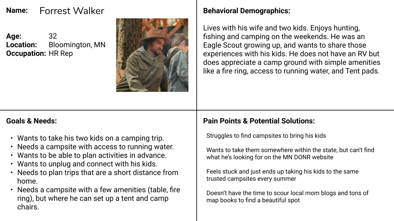
In order to decide on a user path for our initial tests, we wanted to identify some common objectives of the typical DNR website user. To do this, we built a proto-persona based on some of the highlighted features on the homepage and what we knew of the DNR.
Meet Forrest
Forrest is a father who wants to take his two kids out in the outdoors to experience it like he did as a child. Forrest was a boy scout, so he has a lot of experience in the outdoors, but his family is less experienced. His main objective when visiting the site is to find a campsite that is easy to reach and has basic camping amenities.

Our next step was to built a path through the DNR website that Forrest would take while planning a camping trip for his family. We charted this user path and used it to plan out our tasks for user testing.

We conducted user interviews and usability tests with five different users, asking them to navigate both the desktop and mobile versions of the DNR site.
Users were asked to find information about camping, select a state park, and navigate to where they would make a reservation within the park. Overall, the process was very frustrating for the users and they had a lot of feedback to provide us.
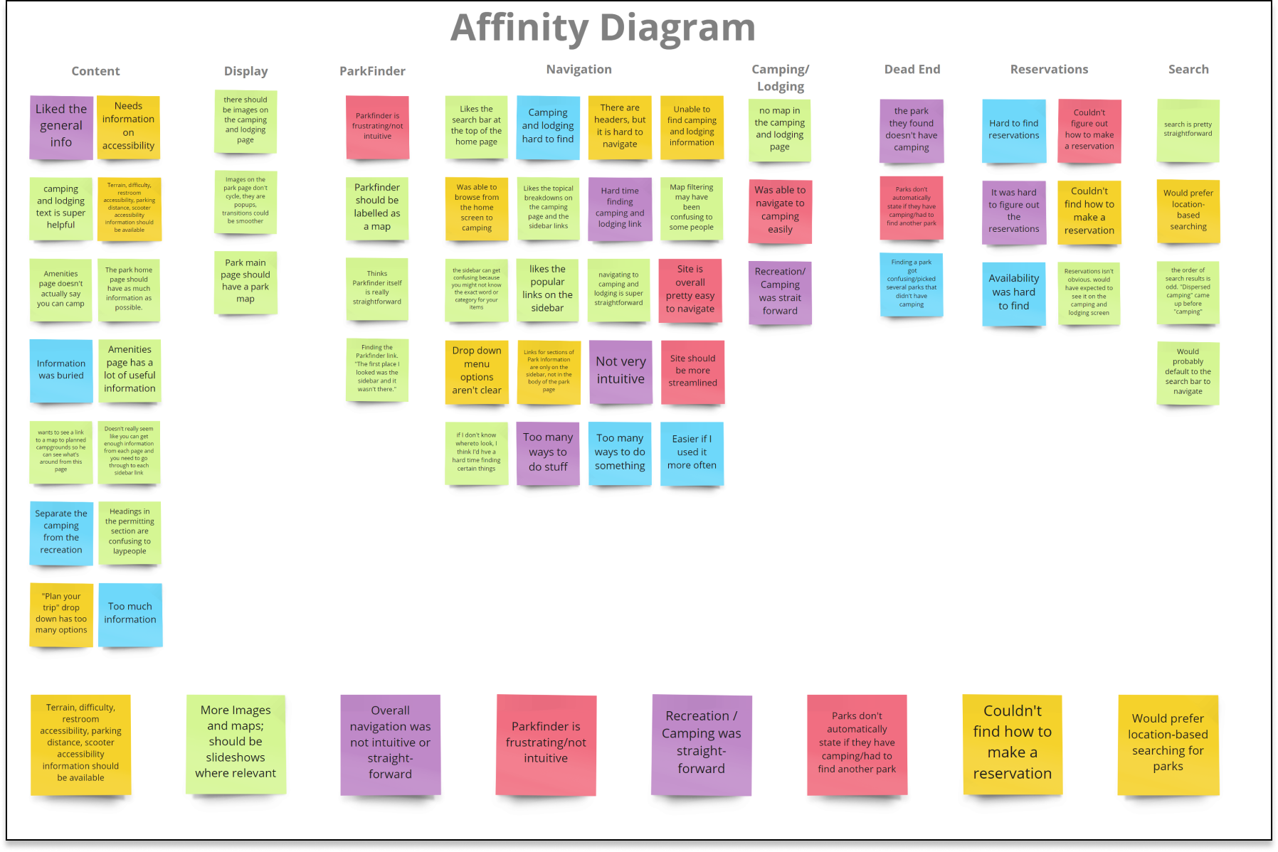
Having walked out users through Forrest's camping trip planning experience, we synthesized their feedback into an affinity diagram to target specific aspects of the site design. Some of the most common feedback included:

We used the insights gained from our user interviews to further build out Forrest's persona into an empathy map. Building our Forrest's goals, pains, and gains helped us focus on our objectives for the redesign.
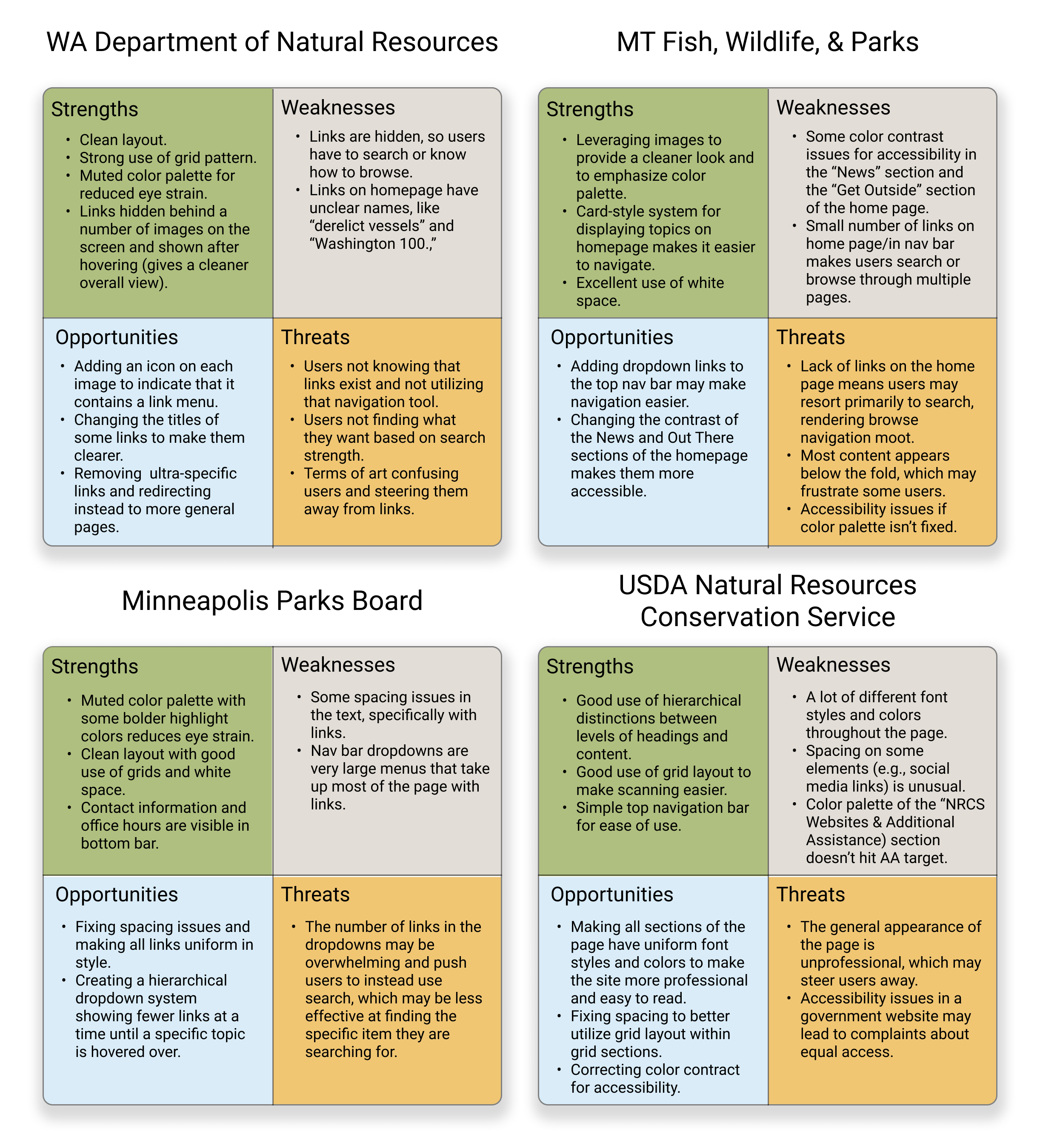
We compared the features of four websites for government agencies with similar missions to the Minnesota Department of Natural Resources using SWOT analysis matrices. Muted color palettes, strong use of imagery, clean layouts, and use of cards to improve navigation were all elements of these pages we would lean on when iterating on the current DNR site design.
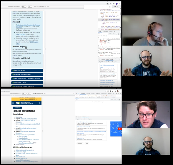
We conducted navigation tests with five different users, asking them to navigate both the desktop and mobile versions of the DNR site. Users were asked to navigate to three different pages on the DNR website using the navigation menus or the search bar.
The navigation tests further confirmed that the DNR website is not intuitive or user friendly. In fact, users were unable to complete any of the assigned tasks on the first try and often needed to restart the navigation task from the home page at least once before being able to find the correct page.
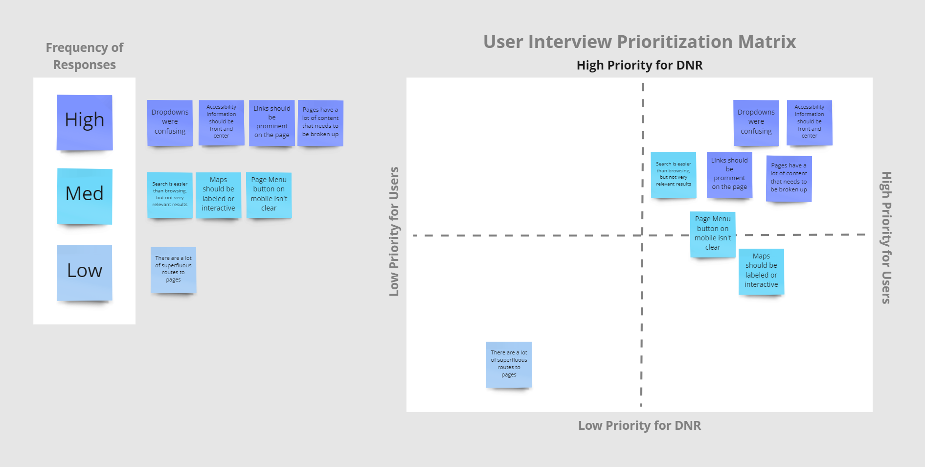
We used the results of our user tests to identify four primary areas of focus for our redesign of the site:
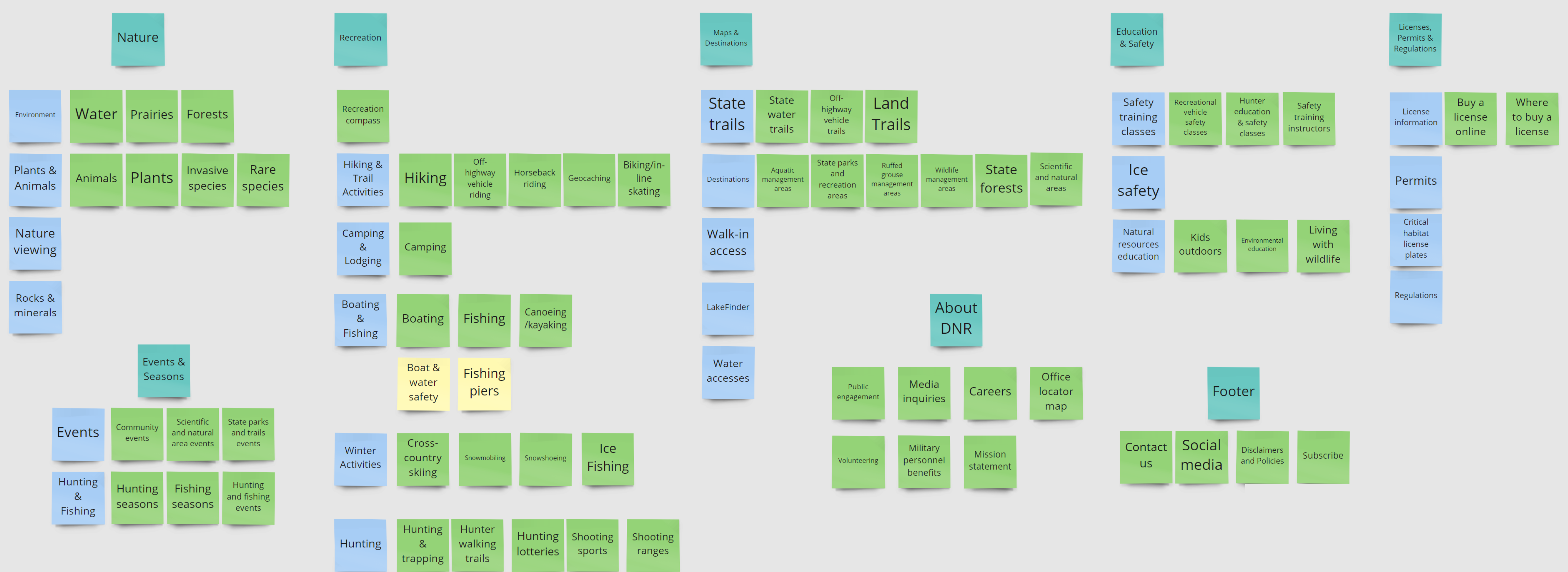
In order to improve site navigation, we performed card sorting in Miro to get a better idea of the ideal layout for the site. We used the results of this card sorting activity to iterate on the current site map.

Our redesigned sitemap broke the site into seven primary categories:
It also included a home page with a search utility and a footer containing contact information, social media links, a subscribe function, and a link for media inquiries.
Once we completed our sitemap, I began work on designing a desktop and mobile navigation prototype.
I built our desktop navigation using cascading overlays in Figma. Each overlay opens any sub-menus using a hover interaction.
We chose this style of navigation to maximize the amount of content we could link to without overcrowding the home page.

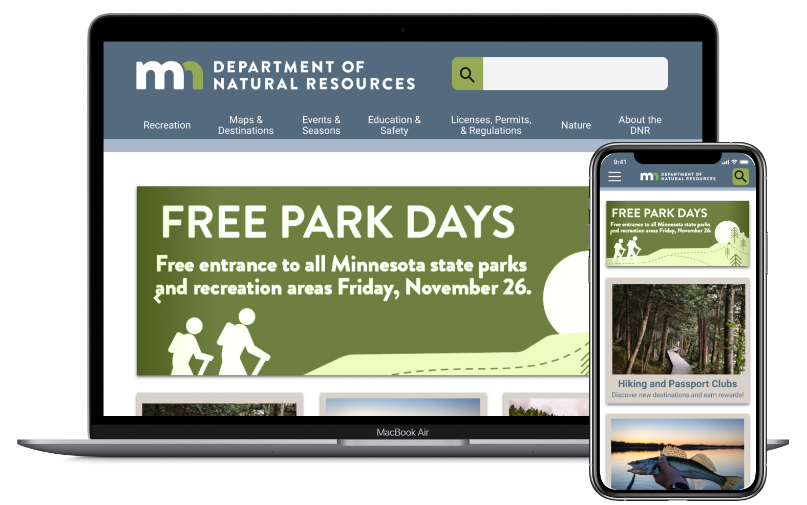
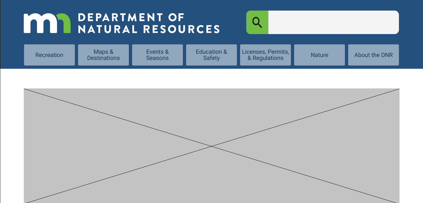
We designed our desktop homepage to leverage the sites subject matter and the abundance of imagery available for a natural resources website. A hero image would catch the user's attention immediately, but would end before the fold and show some of the content below.
We include cards to make some of the most important or commonly used pages more easily accessible, with each card featuring a large image and short description.
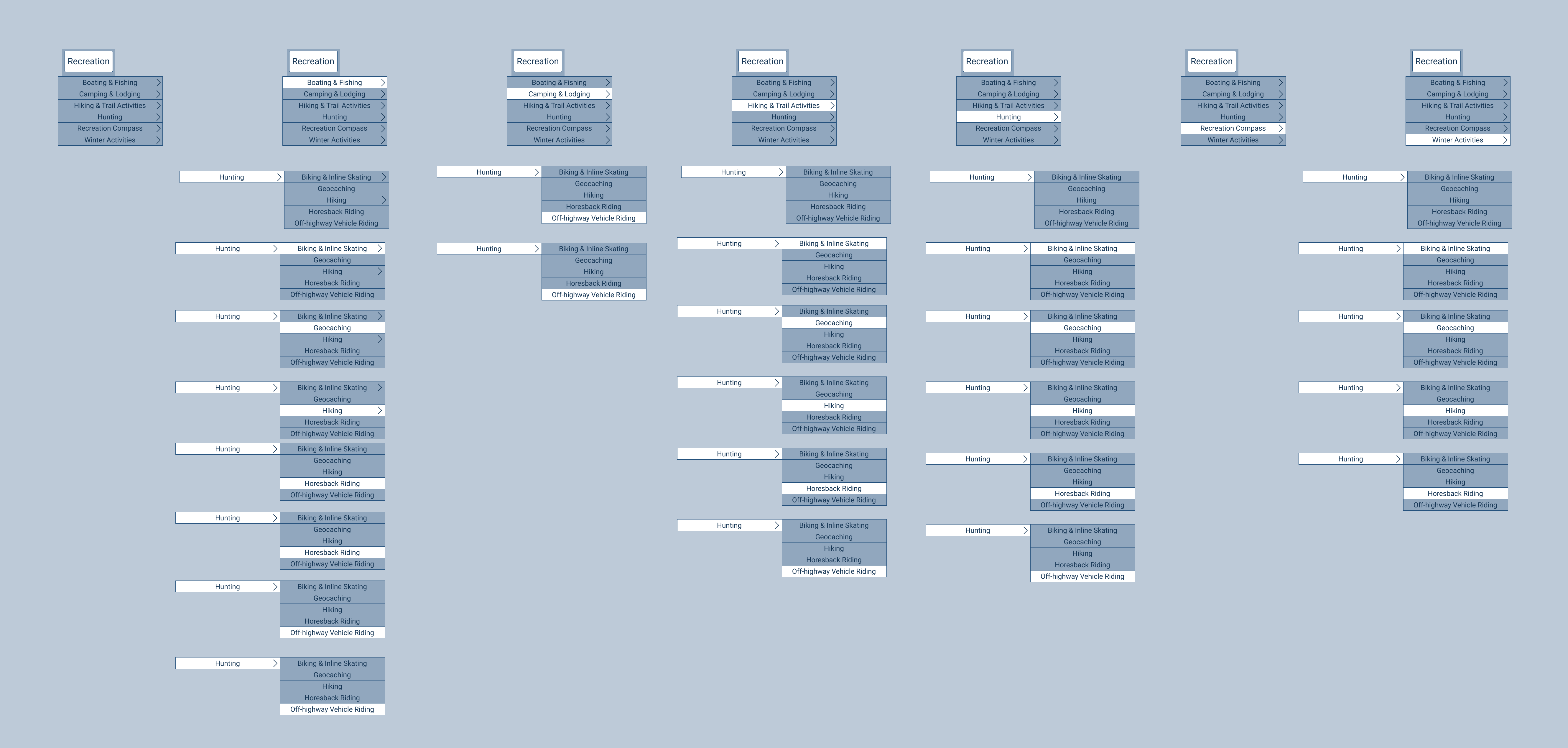
We iterated on our initial dropdown menus by changing the color and shape of the menus. We also rearranged the top-level menu items to make them fit into the screen more easily.
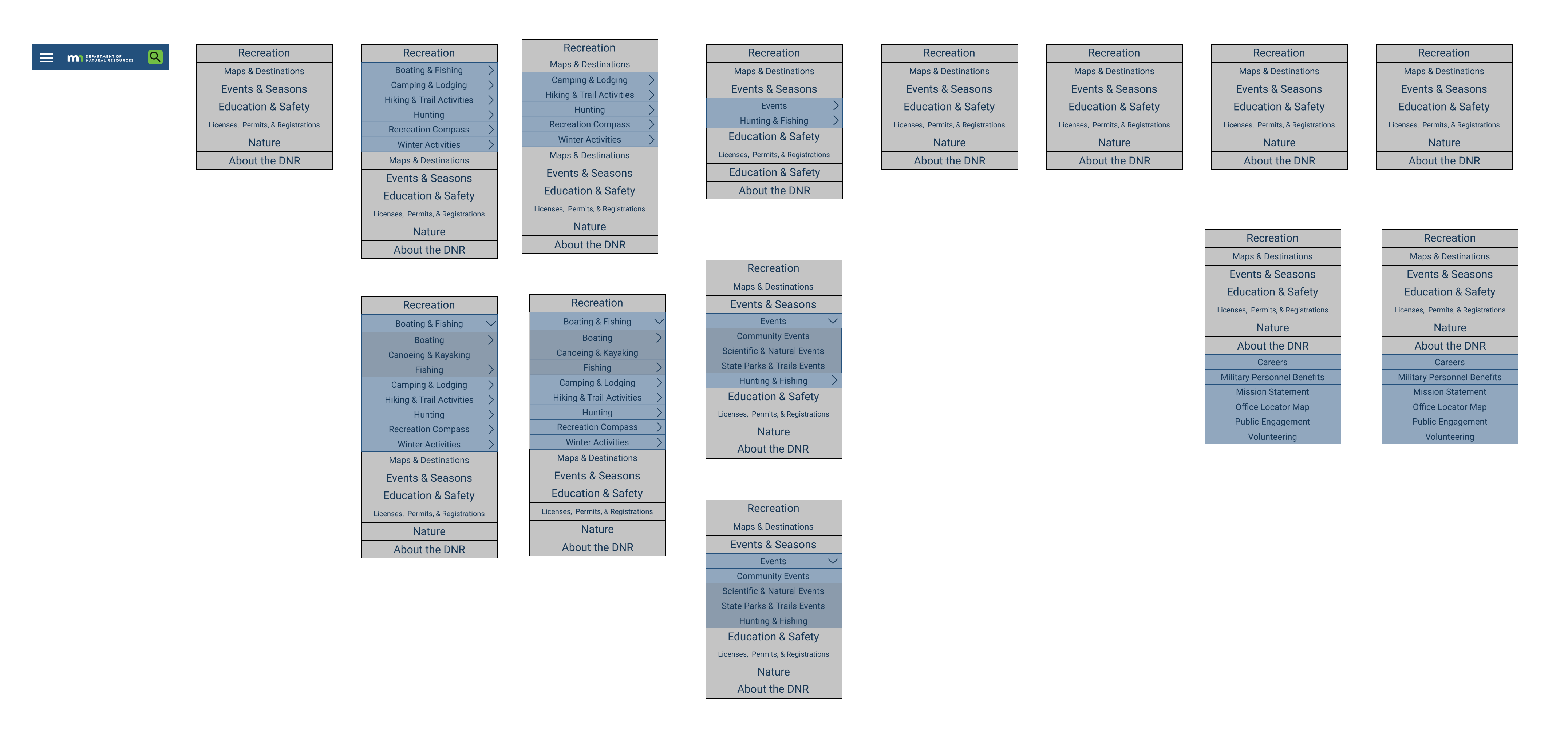
Our mobile navigation made use of a hamburger icon which opened an expandable accordion menu. Primary, secondary, and tertiary pages within the menu were color coded by depth within the site.

We created a preliminary style tile based off of inspiration from our Invision moodboard. We chose a lot of nature imagery and a color palette that suggested a calm, clean, and natural design.
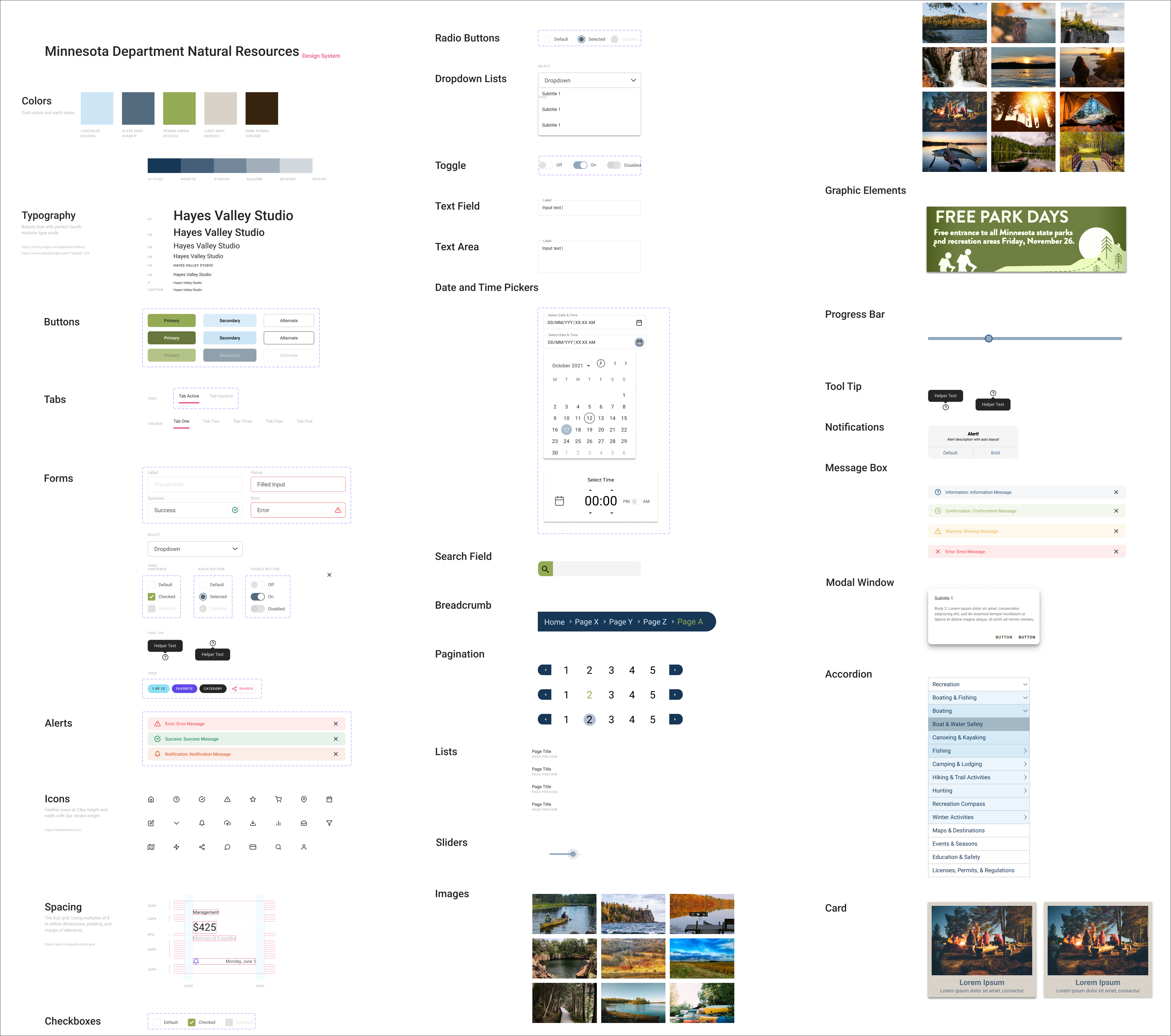
After creating our style tile, we built an expanded style guide for the DNR site. Although a lot of the elements in our style guide are not used in our responsive redesign, having predefined elements could make future iterations or expansions of our design move much more quickly.
Our color palette and typography were very important in our redesign. We chose a font that is easy to read and paired it with neutral tones that are bring to mind nature imagery. We also toned down the bright green and navy that are used in the current Minnesota DNR logo.

We conducted five 5-second user tests to get first impressions of our high-fidelity design. Feedback on these tests was very positive, and users felt that the design was appealing (in particular, the muted palette and use of images) and the navigation seemed clear.
Our high-fidelity desktop prototype relied heavily on hover interactions for both the top navigation and the cards within the page. We focused on maximizing the use of photographs to increase the impact of the page while also helping make the page easier to navigate.
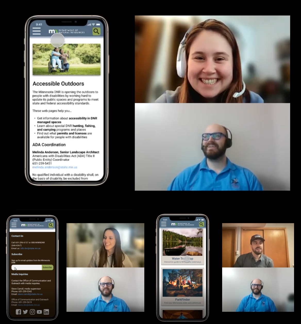
I conducted three different tests of our mobile navigation to make sure it was as user-friendly as possible. I received both positive feedback and suggestions for improvement from these tests.
Positive Feedback
Suggestions for Improvement
The results of these tests helped inform our next iteration of both the mobile site and the desktop page.
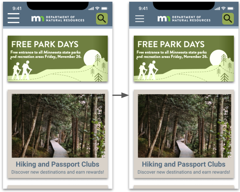

We received feedback that our hamburger icon was oversized and ran too close to the clock above it. We decreased the size of the hamburger icon while keeping the trigged space for opening the hamburger menu the same size. We also changed the Accessible Outdoors image to something more appropriate and added a separation line to mark the top edge of the footer.
Our final Mobile Prototype features a cleaner accordion-style hamburger menu, in-page card navigation, and search overlay for the top nav bar.
In the future, I would continue to iterate on our design with by targeting some specific elements:
Some of our navigation is a bit slower than we’d like or doesn’t quite have the flow that we want. We would fix this by testing and resetting each interaction so it matches our vision.
The current hero image on the homepage would ideally be one of several images or messages in a scrolling carousel.
We had some user complaints about the way the DNR search function retrieved results. By overhauling the content with a good run of UX writing, we could improve search engine optimization and help correct this issue.
I learned several valuable lessons during this site redesign that I will apply in the future on other design projects:
Some users will continue to prefer search over navigation due to the amount of content, despite drastic improvements.
This project required the use of overlays, components, and variants, which we hadn’t worked with much in the past.
Using a moodboard in Invision provided a single source for images and inspiration for our design elements so we didn’t have to keep going back to find examples of what we wanted for our redesign.