UX Bootcamp Case Study
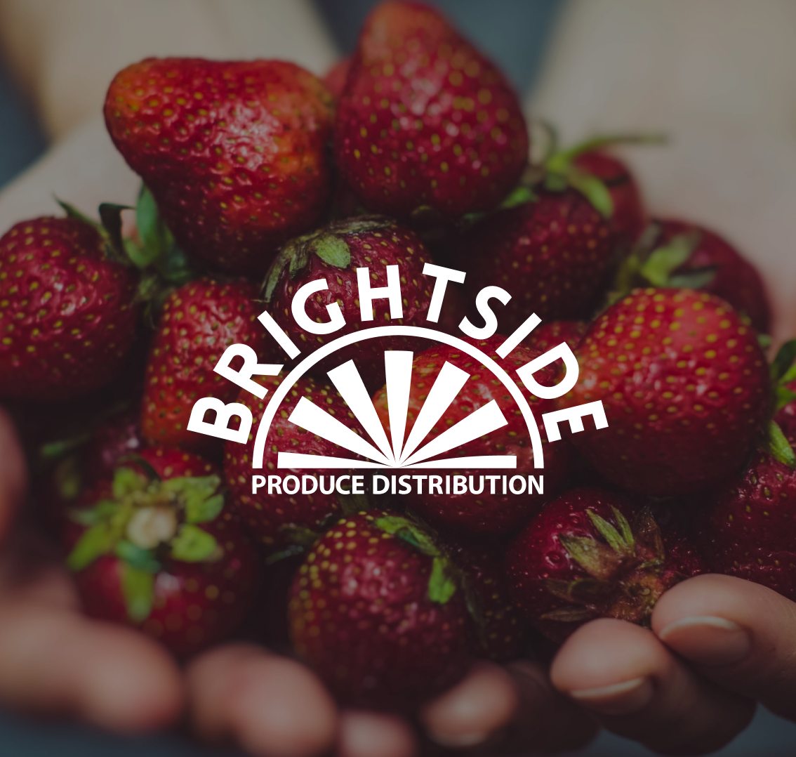
BrightSide Produce
A design overhaul of a nonprofit website emphasizing ordering functionality and clarity of mission as part of my UX/UI design certification course.
Food insecurity is a growing problem throughout the United States. Many lower-income families rely on small convenience stores for most of their groceries., which tend to offer few, if any, fresh fruits and vegetables. Store owners would often purchase their produce at other grocery stores and resell it at high prices.
BrightSide produce was created to combat this issue. BrightSide buys wholesale produce in bulk and resells it to local stores for only 10% above wholesale prices, allowing store owners to keep their prices lower and giving them easier access to a steady supply of fruits and vegetables. BrightSide sustains itself by also offering home deliveries that include a food justice surcharge. Profits from home deliveries allow BrightSide to pay community youth employees and maintain operations, which the food justice surcharge helps support the nonprofit's "pay what you can" home deliveries to families in need.
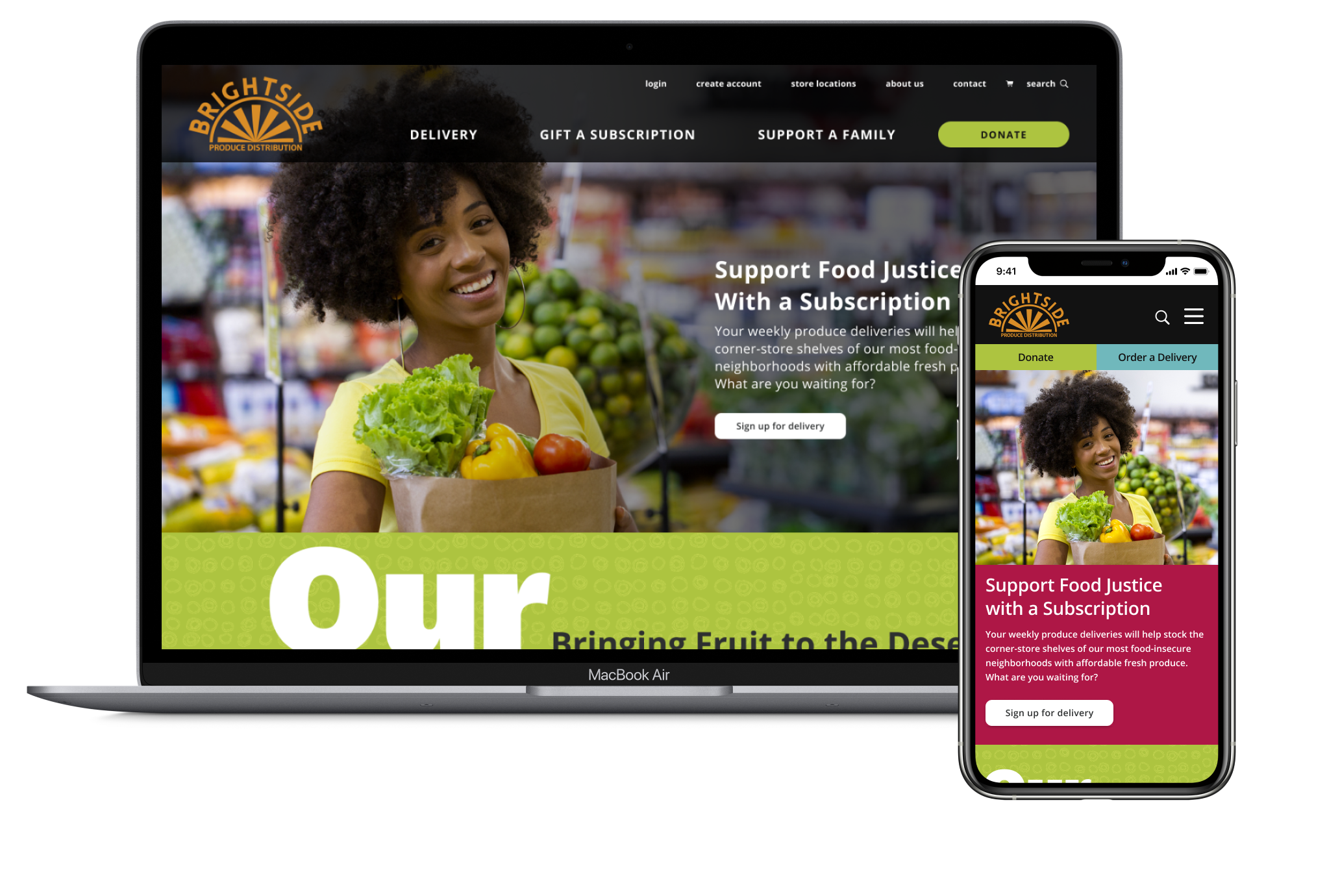
BrightSide's current website features a mobile-first design with a number of accessibility issues. It is very text-heavy, and users have a hard time finding things, including the group's mission and information on home deliveries. I worked with a small team to overhaul the site in a way that highlights the organization's incredible mission and simplifies the ordering process.
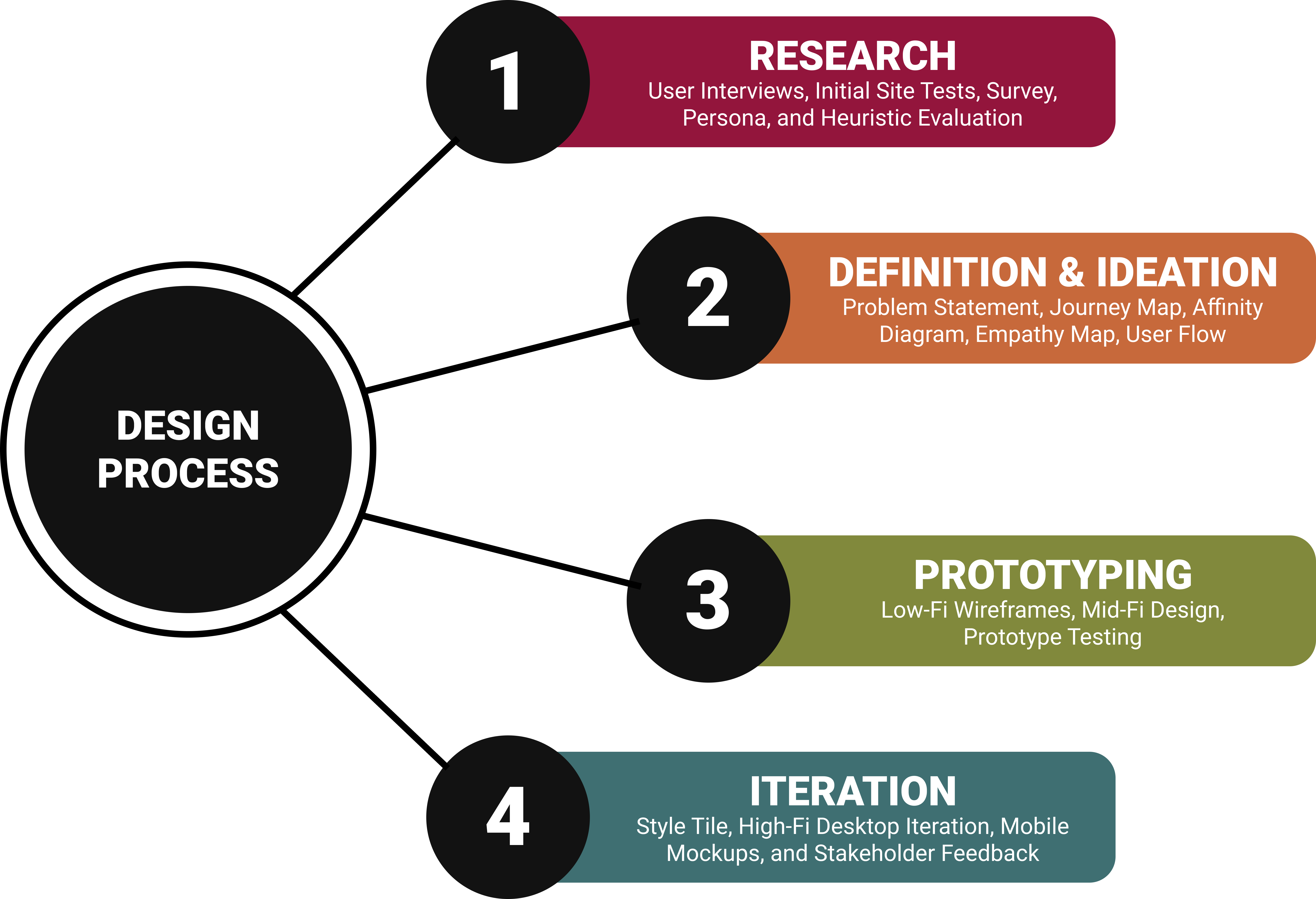
I was very much a UX design generalist in this project. My work on this redesign included:
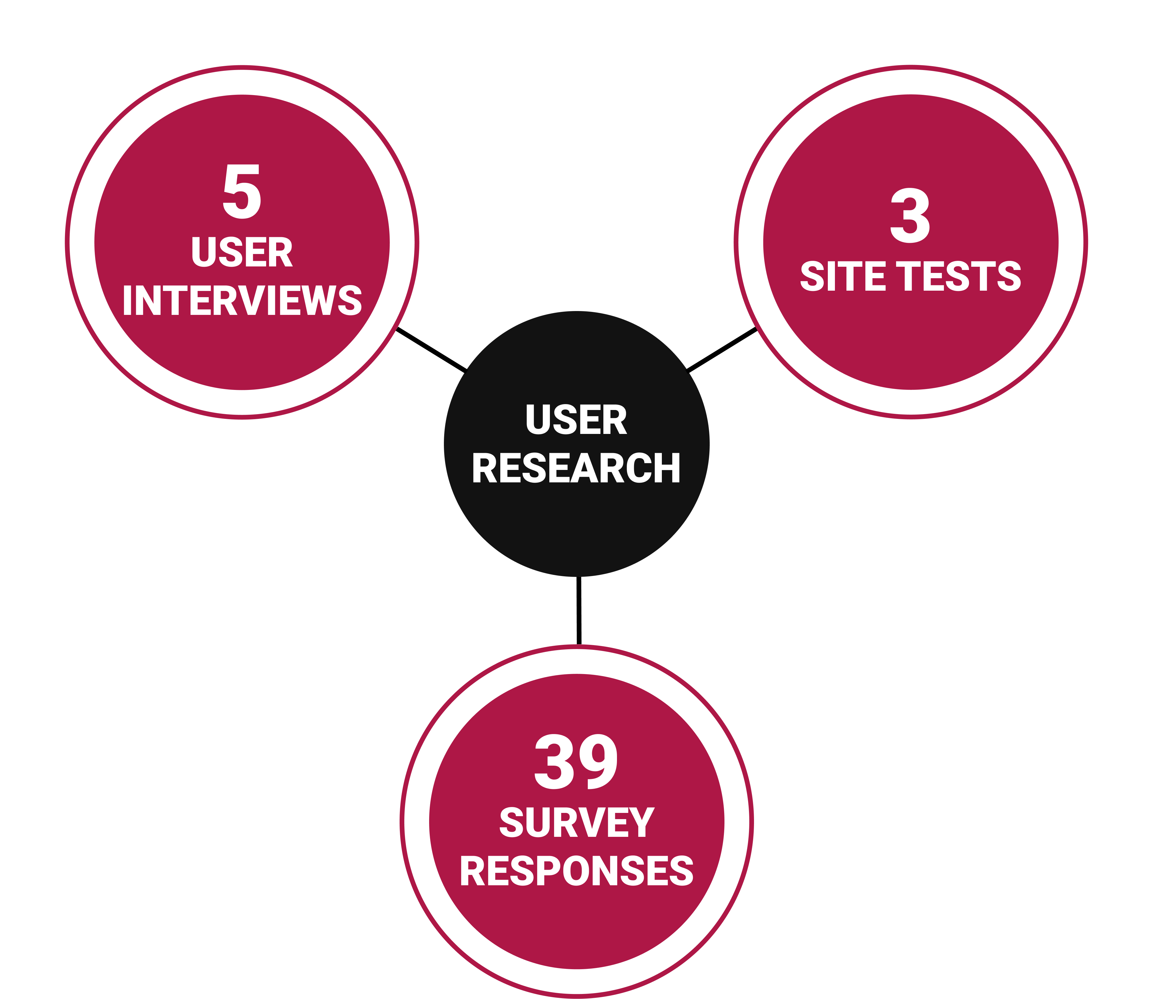
We interviewed five adults ranging in age from 22-54 about their current charitable giving and grocery shopping habits:
We also created a survey asking respondents how shopping habits relate to supporting charity and received 39 responses. The biggest takeaways were:
To better understand how users navigate the current BSP website, we conducted three different tests, having users complete three tasks:
We observed that users find the website to be too text heavy, which made it less skimmable and obscured the Mission and Impact. Users also had difficulty finding information about signing up for deliveries.
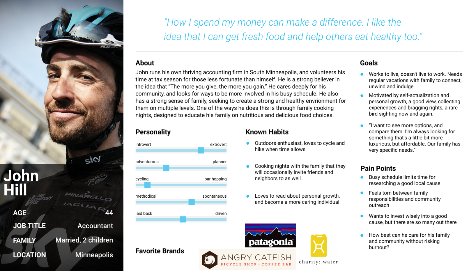
Before moving forward with our redesign, we created a person to identify our target user. This persona informed much of our redesign.
Meet John
John is an accountant from Minneapolis. A community-minded family man, John believes in doing everything he can to make the world a better place for his wife and children. John continually tries to find ways to live his values while balancing his busy professional and home schedules.

To better understand where we wanted to take the BrightSide Produce website with our redesign, I performed a heuristic analysis of 8 different pages on the existing site. I identified a number of issues with the site that reflected what we heard in our initial user tests, including:
We observed that site visitors find BrightSide’s website too text-heavy and that it is difficult for new visitors to find information about the mission and signing up for deliveries.
"How might we improve Brightside Produce’s website so that site guests are able to successfully understand and navigate the site, based on an increase in total number of both home delivery subscriptions and donations?"
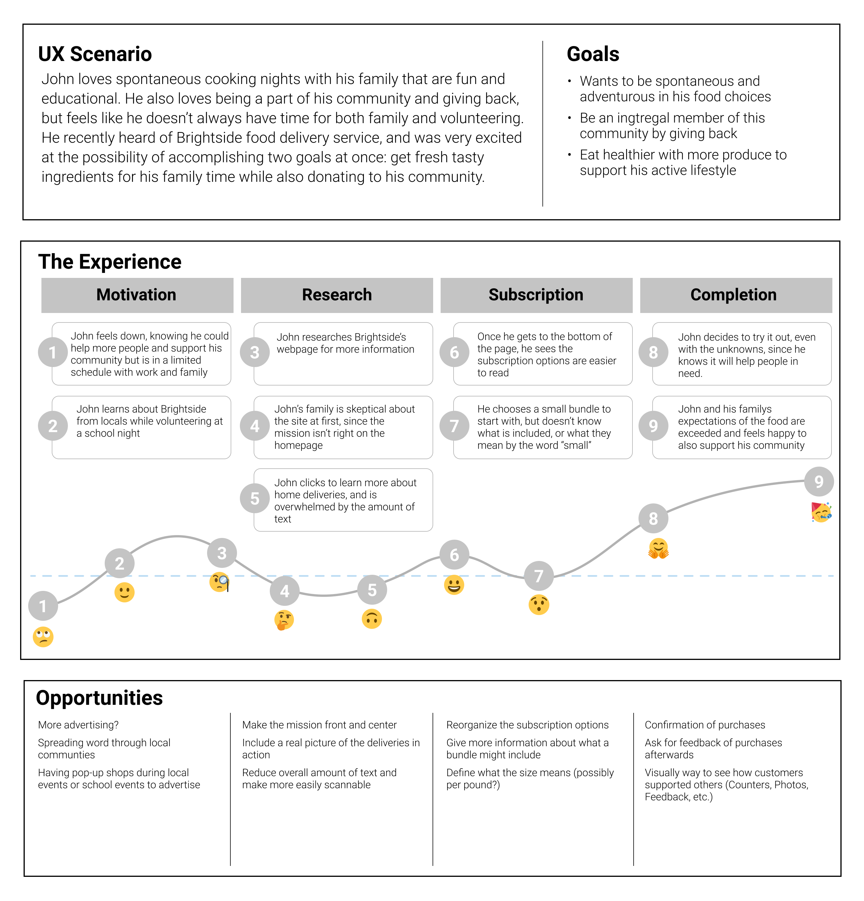
We created a journey map for John's experience discovering and using BrightSide's website. The journey map helped us to identify several specific opportunities for improvement as we began definition our redesign concept:
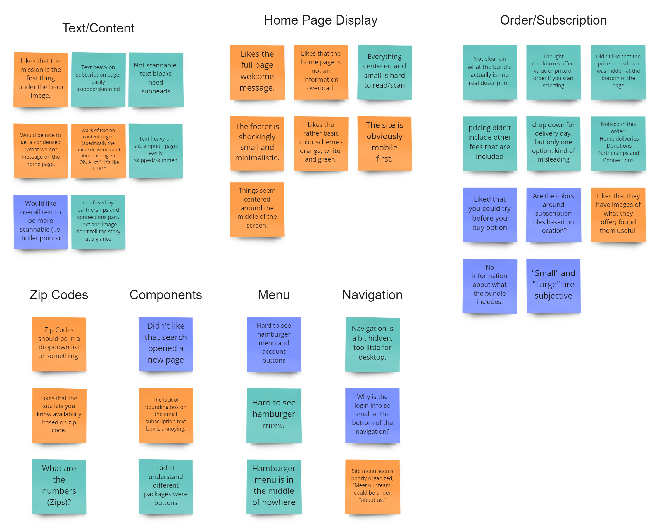
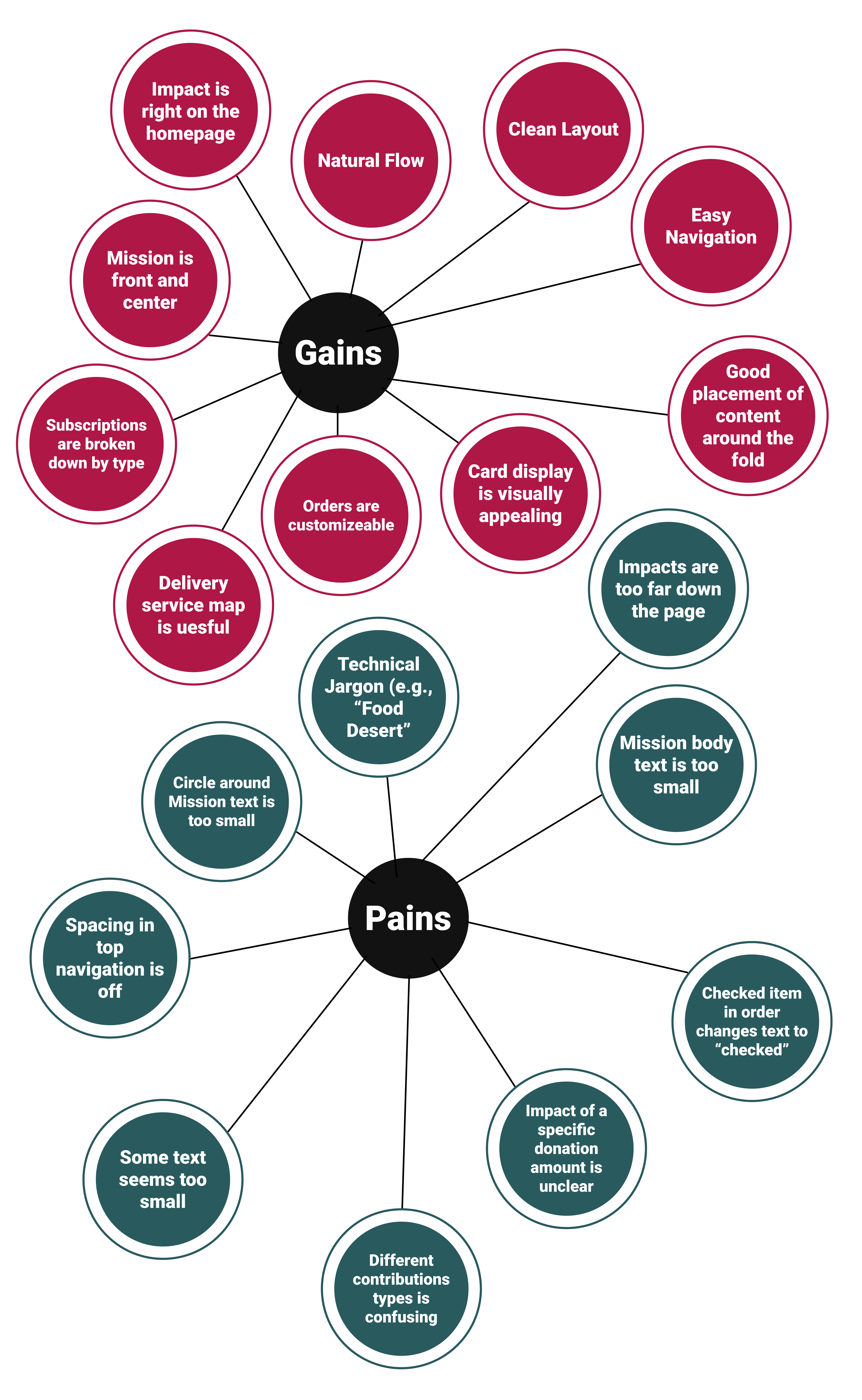
Using the insights gathered from our user tests, we created an affinity diagram targeting specific aspects of the site design. Some of the most common feedback included:
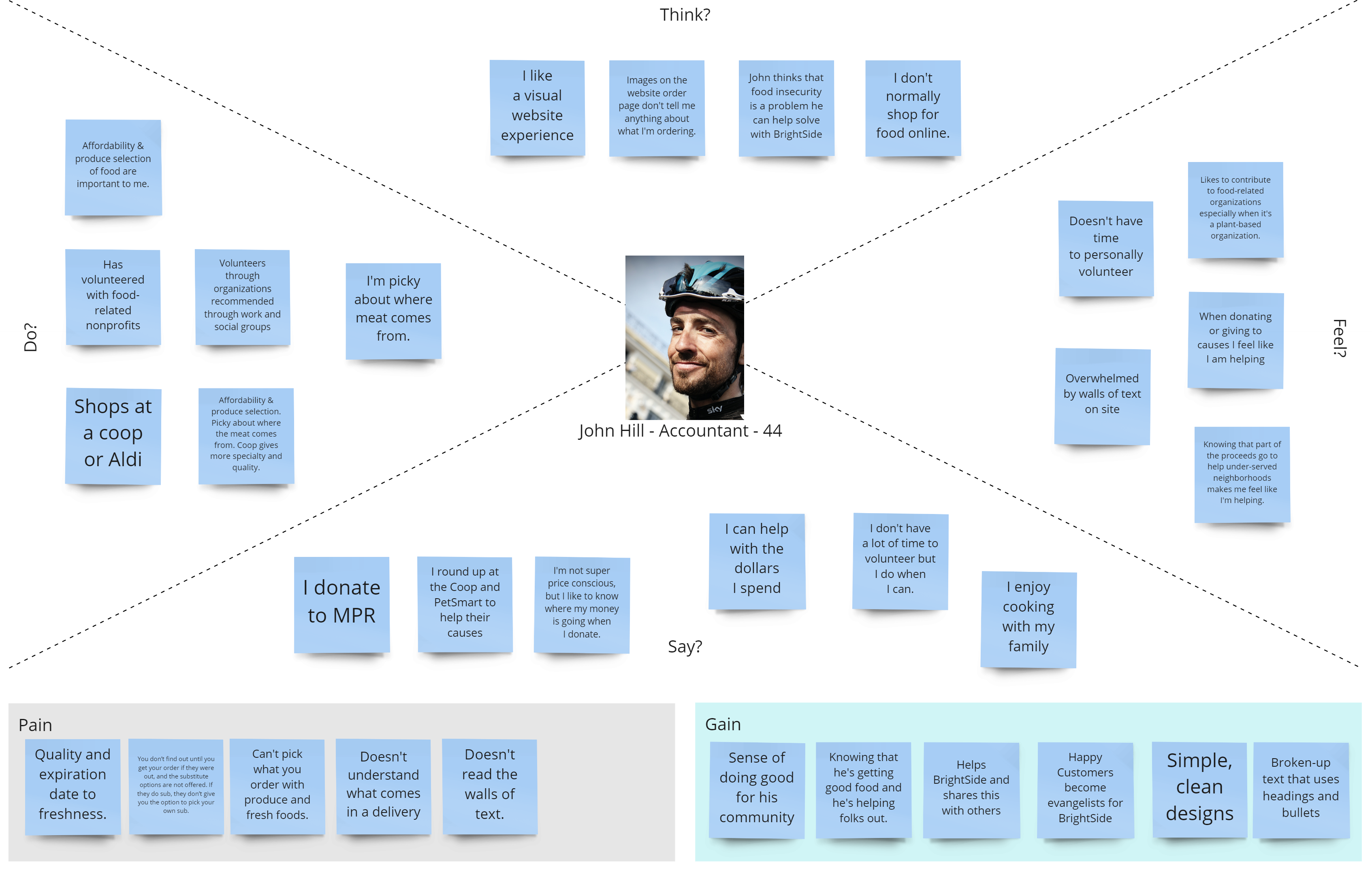
We used the insights gained from our user interviews, tests, and survey to further build out John's persona into an empathy map. Building our John's goals, pains, and gains helped us focus on our objectives for the redesign
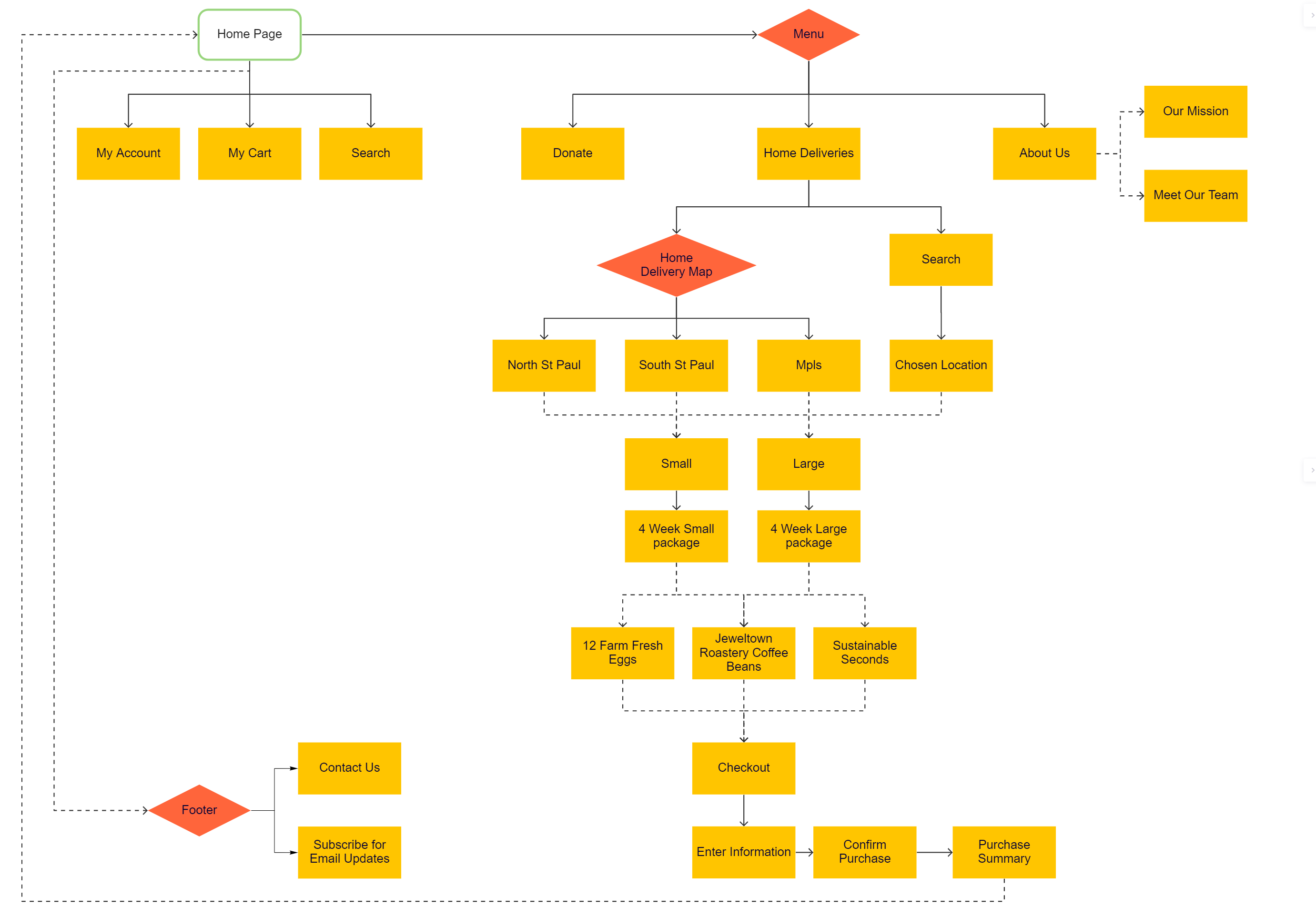
Our journey map, affinity diagram, and empathy map informed our design of an updated user flow which broke the body of the site into three key categories: donations, home deliveries, and an "About Us" section.
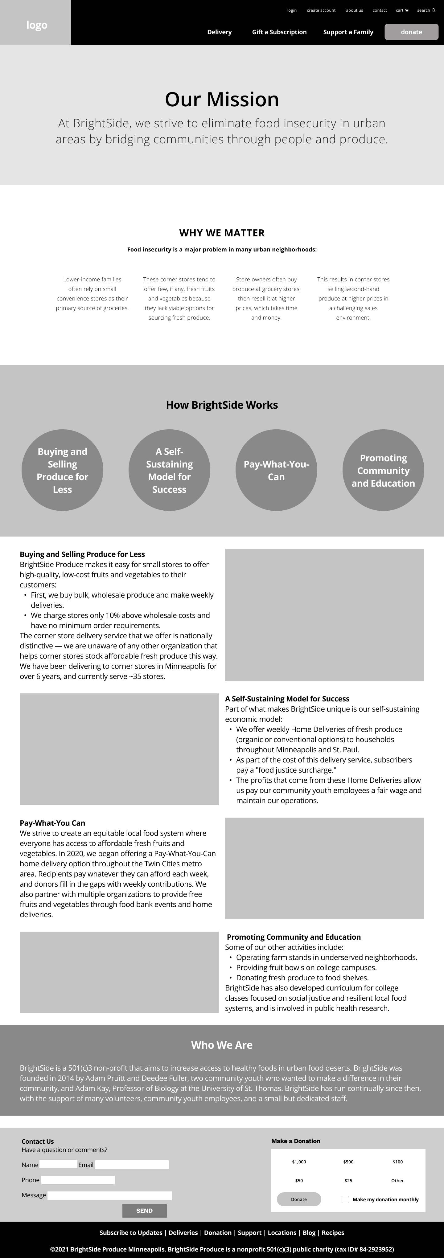
We designed our low-fidelity wireframes with a focus on breaking up large blocks of text, highlighting the missions and impacts of the organization, and leveraging colorful imagery of the people and produce around which BrightSide is built.
Our jump from low-fidelity to mid-fidelity focused on bringing in actual content in the form of copy and images. We experiments with some background color and texture at this stage as well.
We ran users through a set of three tasks on our mid-fidelity prototype. Although they were all able to successfully complete each task, we received a lot of feedback for recommendations on how to improve the site during our iteration from mid- to high-fidelity, including:

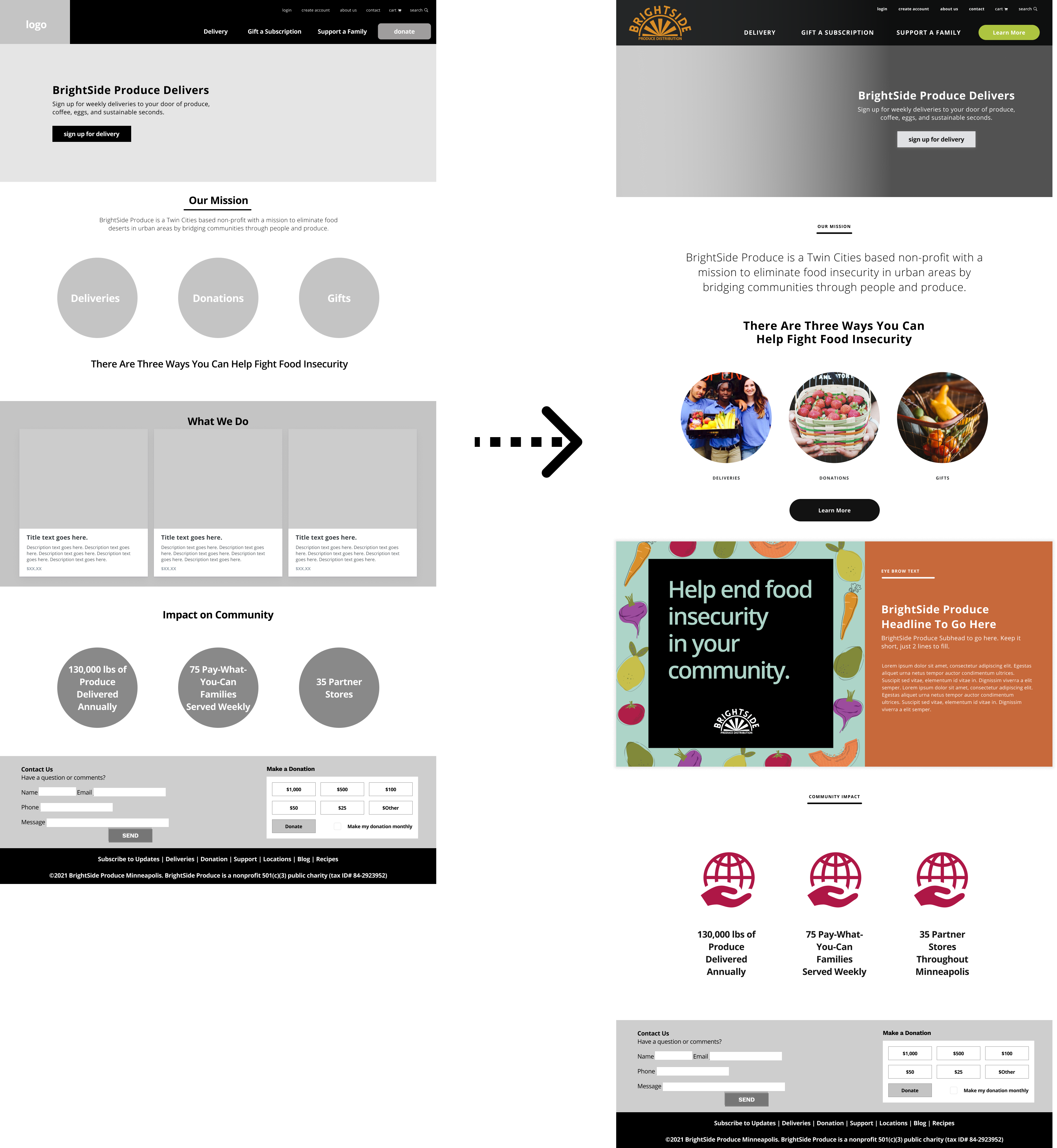
We were fortunate to partner with an organization that already had a style persona in mind. Hearing the phrase "rebel next door," we knew we wanted to focus on bold colors that leverage the vibrancy of fresh produce. Playing those colors off of each other and a strong black nav bar and footer would make graphics pop and allow for strong contrast with a white page.
Our final, high-fidelity mockup made use of our style tile and the results of our mid-fidelity user testing. In particular, our redesign provides a mission-forward look at BrightSide Produce with an emphasis:
The site's new design is aimed at connecting more people with the organization and allowing BrightSide to maximize its community impact through enhanced engagement.
Because BrightSide's current site design is mobile-first, we wanted to create a prototype for a mobile version of the site as well. The mobile design condensed the top navigation into a hamburger menu and features two large buttons at the top of the screen for donating or signing up for delivery.
Adam and I took a look at the link you sent as a prototype—we love it! It looks amazing. The visuals are great, and the customer experience will be so much more straightforward."
- Feedback from BrightSide Produce Stakeholder
I learned several valuable lessons during the redesign. Not only did my grasp of working in Figma improve over the course of the project, but I had some other, larger takeaways.
A strong design team makes for a strong design.
I worked with a group of type-A, organized, and borderline obsessive designers on this redesign, and was lucky to leverage their skills in visual design and content creation to create a stronger design than I've created working in other design teams.
It's hard to be a generalist among specialists, but communication can help.
I took a primarily supportive role in this redesign, grabbing what tasks I thought I could help with the most and trying whatever work there was to be done. Being part of a strong design team, I found myself having a harder time figuring out where I should focus because the rest of my team functioned so well in their roles. Communicating what I was doing and checking in on the rest of my team helped me to find ways to provide the most value.
Sometimes, you have to rein in your teammates.
Because we were so excited about this organization and this redesign, we didn't realize until we had already reported back to the stakeholders that our user testing on the redesign was entirely too minimal. This had a definite impact on future projects where user testing became a priority to avoid the same mistake.
BrightSide enjoyed working with us on this project, and expressed interest in our continuing the redesign across all pages and eventually into implementation. This continued work will focus on:
User tests of the high-fidelity wireframes
We learned too late that we neglected to test our mid- and high-fidelity wireframes. It wasn't until we had presented this to stakeholders that we realized how much more testing we should do to make sure the site is as well-designed as possible.
Obtaining metrics on interactions with the site's current design
As we continue to redesign the site and add more wireframes to out prototype, we want to know more about how the site is used. In particular, there are pages we would like to add that don't currently exist (e.g., recipes and newsletters) and pages that do exist but which aren't maintained (e.g., blog). Knowing how and if these would be used by site visitors could greatly inform our redesign.
Planning out site development
After completing our design sprint, we intended to pass our design off to a developer to work with the client on updating their site, but our contact fell through. The client has since updated their site to more closely align with our redesign.